You have probably heard the term UX design thrown around — but what does it actually mean for your website, and why should a business owner care? The short answer: UX design is the difference between a website that loses visitors and one that turns them into customers.
Every time someone lands on your website, they go on a journey. They look for information, try to figure out what you offer, decide whether to trust you, and eventually take an action — or leave. UX design is the discipline that shapes every step of that journey. It is not about how a website looks. It is about how it works, how it feels, and how effortlessly it guides people toward what they need.
At AG Art Studio, UX is baked into every project we take on. It is not a separate phase — it is a lens we apply from the first wireframe to the final pixel. Here is what UX design really means, why it matters more than ever in 2026, and what it should look like on your website.
What UX design actually means
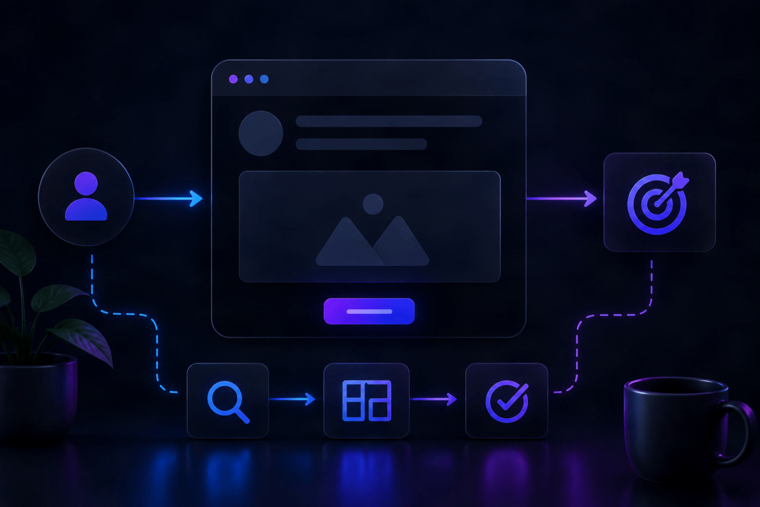
UX stands for User Experience. At its core, UX design is the practice of designing digital products and websites so they are intuitive, efficient, and satisfying to use. It encompasses everything a visitor encounters on your site — the layout, the navigation, the speed, the content structure, the forms, the calls to action, and even the error messages.
UX design is often confused with UI design (User Interface design), and the two are closely related — but they are not the same thing. UI design is concerned with the visual layer: colors, typography, icons, buttons, and the overall aesthetic. UX design sits underneath all of that. It answers the question: does this actually work for the person using it?
A beautiful website with poor UX is like a stunning restaurant with terrible service. The first impression draws people in, but the experience drives them away. A well-designed UX keeps people on your site, guides them to the right place, and makes it easy for them to do what you want them to do — whether that is making a purchase, filling in a contact form, or simply finding the information they need.
The core principles of good UX design
Understanding what makes UX design effective starts with a few foundational principles that apply to every website, regardless of industry or size.
Clarity over cleverness
The most common UX mistake businesses make is prioritizing style over clarity. Navigation labels that are vague or creative-sounding ("Our Universe" instead of "About Us") might feel on-brand but they confuse visitors. Clear, direct language always wins. Users should never have to guess where to click or what a page is about.
Hierarchy guides attention
Every page on your website has one primary goal. Good UX design makes that goal unmistakably clear through visual hierarchy — using size, contrast, spacing, and color to direct the visitor's eye to what matters most. Without hierarchy, every element competes for attention equally, and nothing stands out.
Friction is the enemy of conversion
Friction is anything that makes a visitor slow down, hesitate, or work harder than they should. A contact form with too many fields. A checkout process with unnecessary steps. A page that loads slowly. A CTA button that is hard to find. Every piece of friction reduces the likelihood that someone completes the action you want them to take.
Consistency builds trust
When buttons look and behave the same way throughout your website, when fonts and colors are used consistently, and when navigation is predictable, users feel confident. They build a mental model of how your site works and can move through it without thinking. Inconsistency — a button that looks different on one page, a navigation menu that changes — breaks that trust.
Feedback reassures users
Every interaction on your website should produce a visible response. When someone hovers over a button, it should change state. When a form is submitted, there should be a clear confirmation. When a page is loading, a progress indicator should appear. These feedback signals tell users that the system is responding to them — and their absence creates uncertainty and doubt.
Why UX design matters more than ever in 2026
User expectations have never been higher. Years of interacting with polished, intuitive apps from companies like Apple, Airbnb, and Stripe have permanently raised the bar for what a good digital experience feels like. Visitors now arrive at your website with a calibrated sense of what smooth feels like — and they notice instantly when something falls short.
In 2026, several forces are making UX even more critical for businesses.
Google rewards UX directlyGoogle's Core Web Vitals — the performance metrics that influence search rankings — are fundamentally UX metrics. They measure how fast your page loads, how stable it is while loading, and how quickly it responds to user input. A website with poor UX is increasingly a website that ranks lower in search results.
Competition for attention is fiercerAverage attention spans online are short and shrinking. Studies consistently show that users form a judgment about a website within 15 seconds of landing on it. If your website's UX does not immediately communicate value and invite engagement, visitors leave — and they rarely come back. With so many alternatives a click away, friction has zero tolerance.
Mobile has changed the rulesMore than 60% of web traffic now comes from mobile devices, and the UX requirements on mobile are fundamentally different from desktop. Tap targets need to be large enough for thumbs. Content needs to be scannable in short bursts. Load times need to be fast on cellular connections. A website designed without mobile UX in mind is failing the majority of its visitors.
AI is raising the personalization barIn 2026, AI tools are making it possible for websites to adapt their UX based on individual user behavior — surfacing relevant content, adjusting navigation emphasis, and personalizing calls to action. Businesses that leverage these capabilities deliver experiences that feel tailored and intuitive. Those that do not increasingly feel generic by comparison.
What good UX looks like in practice
UX design is not abstract — it shows up in very concrete decisions on your website. Here are some of the most impactful areas where UX makes or breaks the experience.
NavigationYour navigation should answer one question instantly: where can I go from here? That means clear labels, a logical structure, and no more than seven top-level items. On mobile, navigation should be thumb-accessible and never require the user to scroll horizontally or hunt for a hidden menu icon.
Page load speedSpeed is a UX issue before it is a technical one. A page that takes more than three seconds to load will lose more than half its visitors, regardless of how good the content is. Every second of delay costs conversions — research has shown a 7% drop in conversions for every one-second delay in page load time.
Call to action clarityEvery page on your site should have one clear, prominent call to action. Visitors should never have to search for the next step. Whether it is "Get a Free Quote", "Book a Call", or "Shop Now" — the CTA should be visually distinct, positioned where the eye naturally lands, and written in action-oriented language.
Form designForms are where conversions happen — and where most websites lose people. Best practice in 2026 is to ask only for information you genuinely need, use smart defaults and auto-fill where possible, display errors in real time rather than after submission, and confirm success clearly. A form that takes 30 seconds to complete converts dramatically better than one that takes three minutes.
ReadabilityText that is hard to read is text that does not get read. Good UX means a font size of at least 16–18px for body text, sufficient contrast between text and background, line lengths that do not stretch too wide, and enough whitespace between sections to let the content breathe. Readability is not a design indulgence — it is a conversion tool.
How to audit the UX of your current website
You do not need to hire a UX researcher to get a sense of where your website stands. Here is a practical self-audit you can run right now.
- The five-second test — show your homepage to someone unfamiliar with your business for five seconds. Ask them what you do, who you serve, and what they should do next. If they cannot answer clearly, your UX has a hierarchy problem
- The mobile walk-through — complete your entire key user journey on a mobile phone: find a service, read about it, and submit a contact form. Note every moment of friction
- Google PageSpeed Insights — enter your URL at pagespeed.web.dev for a free UX and performance score with specific improvement recommendations
- Heatmap tools — free tools like Microsoft Clarity show you where users are clicking, how far they scroll, and where they drop off. The data often reveals UX problems that would otherwise be invisible
- Form completion rates — if you have analytics set up, check what percentage of visitors who view your contact page actually submit the form. Rates below 10–15% often indicate a UX problem with the form itself
- Bounce rate by page — high bounce rates on specific pages signal that those pages are not meeting visitor expectations — either in content, speed, or layout
UX design is not a one-time project
One of the most important things to understand about UX design is that it is iterative, not a one-time deliverable. The best websites in 2026 are built on a foundation of ongoing observation, testing, and refinement. User behavior changes. Business goals evolve. New devices and interaction patterns emerge. A website's UX should evolve with all of these things.
That does not mean constant rebuilds. It means treating your website as a product — something that gets reviewed, measured, and improved on a regular cadence. Even small UX improvements, made consistently over time, compound into significant gains in engagement, conversion, and customer satisfaction.
For businesses without an in-house design team, the most practical approach is to establish a quarterly UX review: look at your analytics, run a basic usability check, and identify the two or three highest-impact changes you can make. Consistent small improvements beat occasional large overhauls.