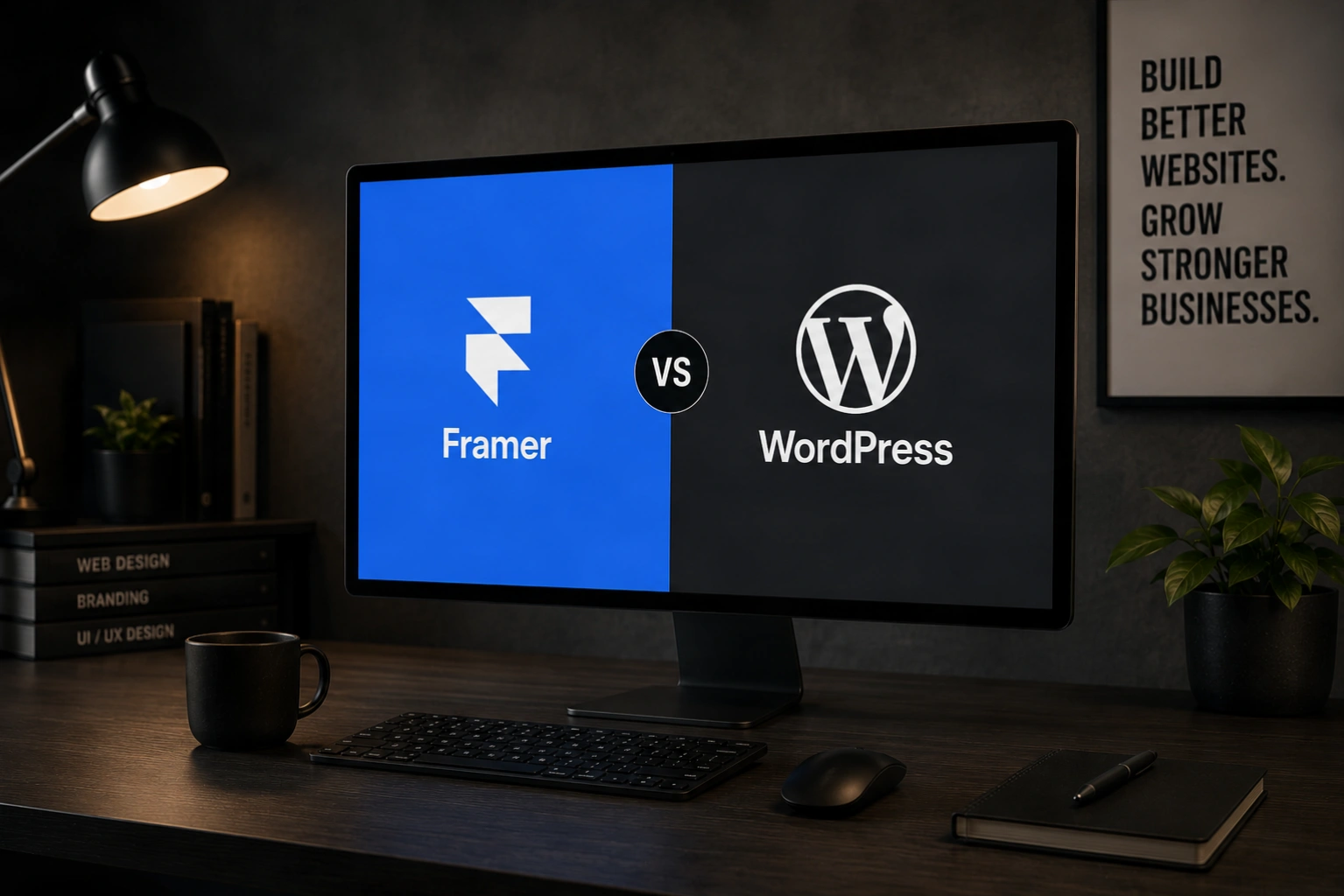
Framer entered the website-building conversation as a fast-rising alternative built specifically around speed, motion, and a design experience that feels closer to using a professional design tool than a traditional...
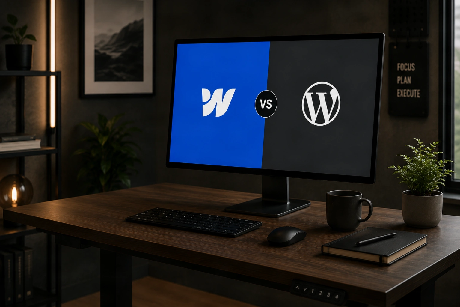
The Webflow versus WordPress debate has become one of the most common questions business owners ask before starting a website project, and it is also one of the most poorly...
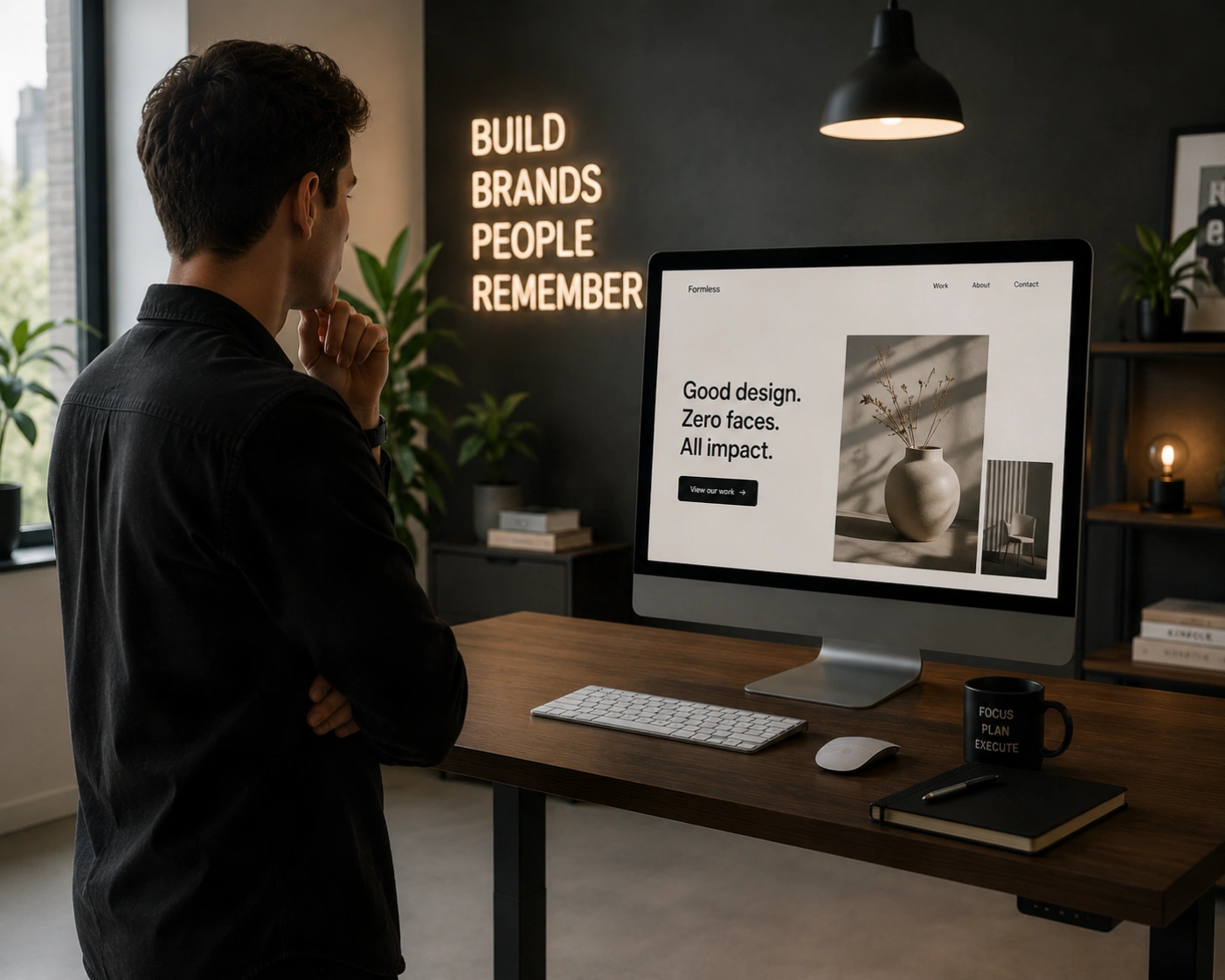
Something is shifting in how people choose the businesses they buy from. Across every industry and price point, consumers are increasingly indifferent to polished corporate presentation and increasingly drawn to...
Artificial intelligence is not a future event in web design — it is already reshaping how websites are planned, built, personalised, and measured. For business owners, this shift is not...
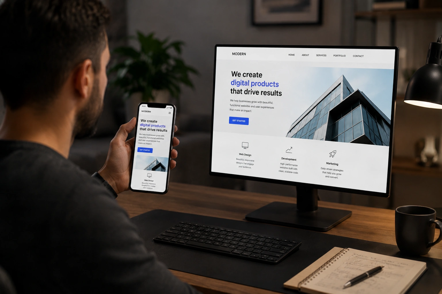
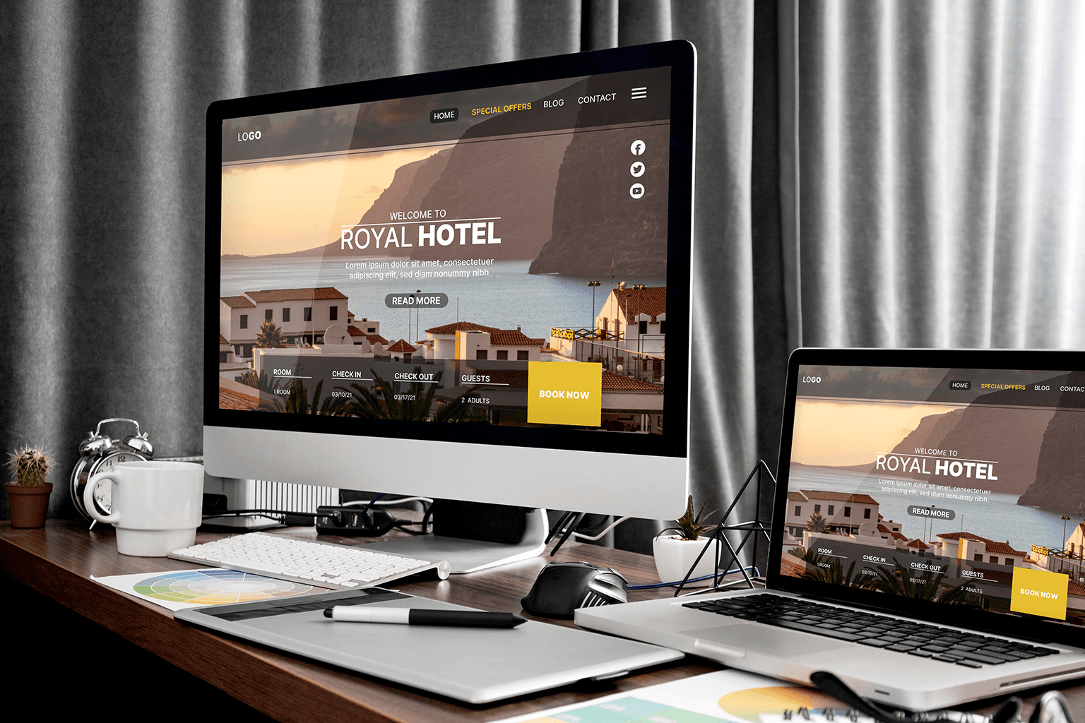
Responsive design is the reason a website can look polished on a 27-inch monitor and just as polished on a 5-inch phone screen. It is not a feature you can...
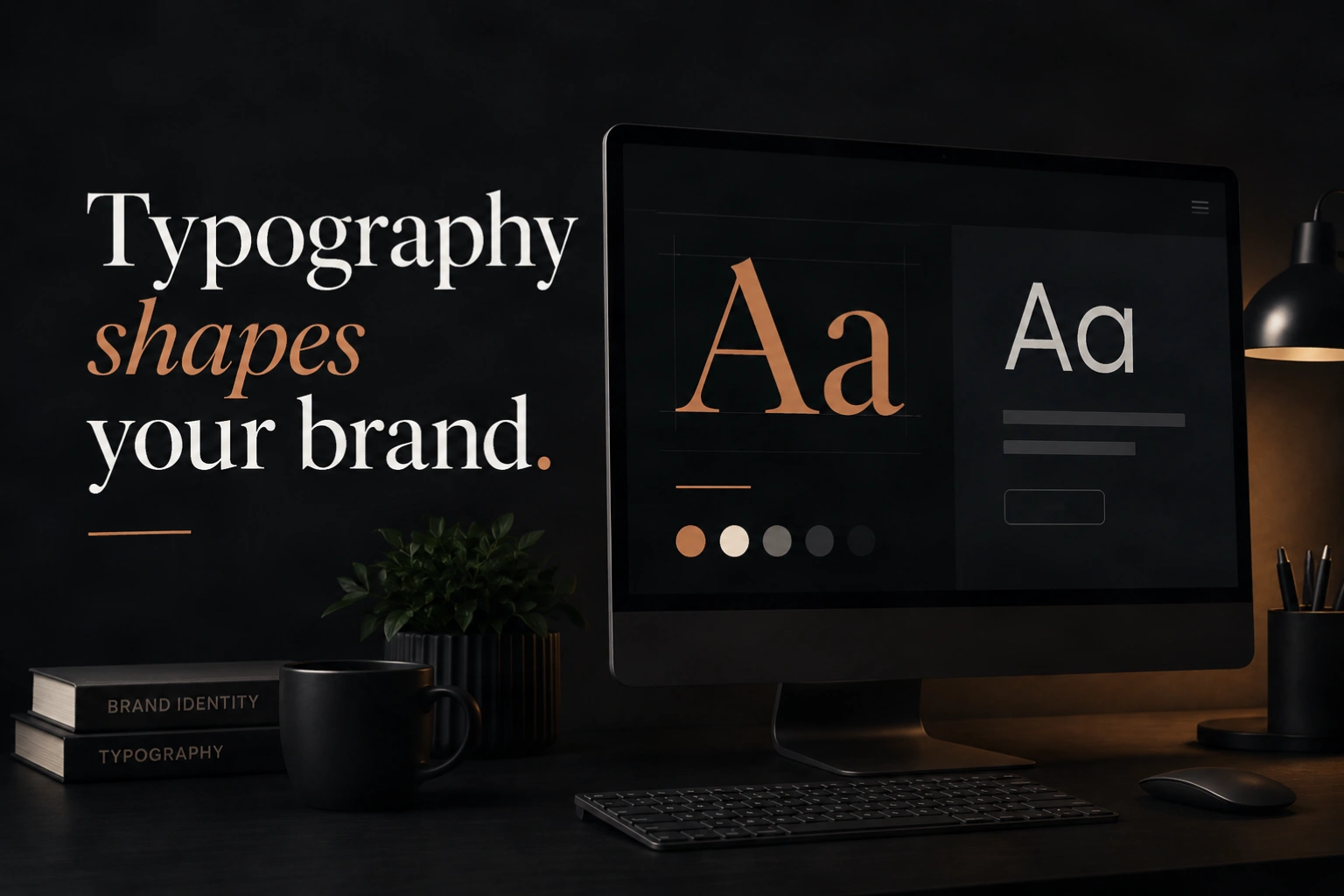
Typography is the silent architecture of every website. It does not shout for attention the way colour or imagery does, but it shapes the experience of every single word a...
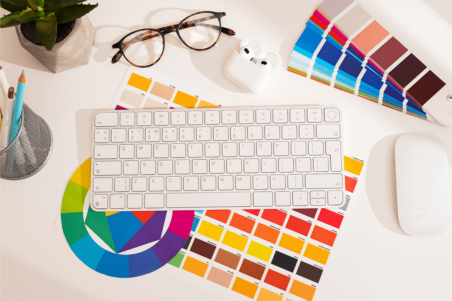
Colour is the element of web design that works fastest and most invisibly. Before a visitor reads a single word on your website, they have already formed an emotional response...
Web accessibility is no longer a niche compliance topic for large enterprises. In 2026, it is a mainstream design standard that affects every business with an online presence, carries legal...
You have 50 milliseconds to make a first impression online. That is less time than it takes to blink. In that fraction of a second, a visitor to your website...
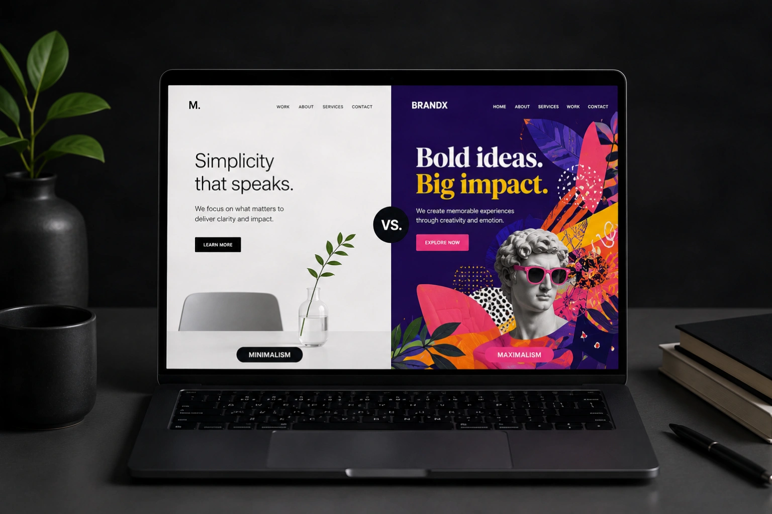
Two of the most powerful aesthetic directions in web design sit at opposite ends of the same spectrum. Minimalism strips everything away until only the essential remains. Maximalism embraces richness,...