

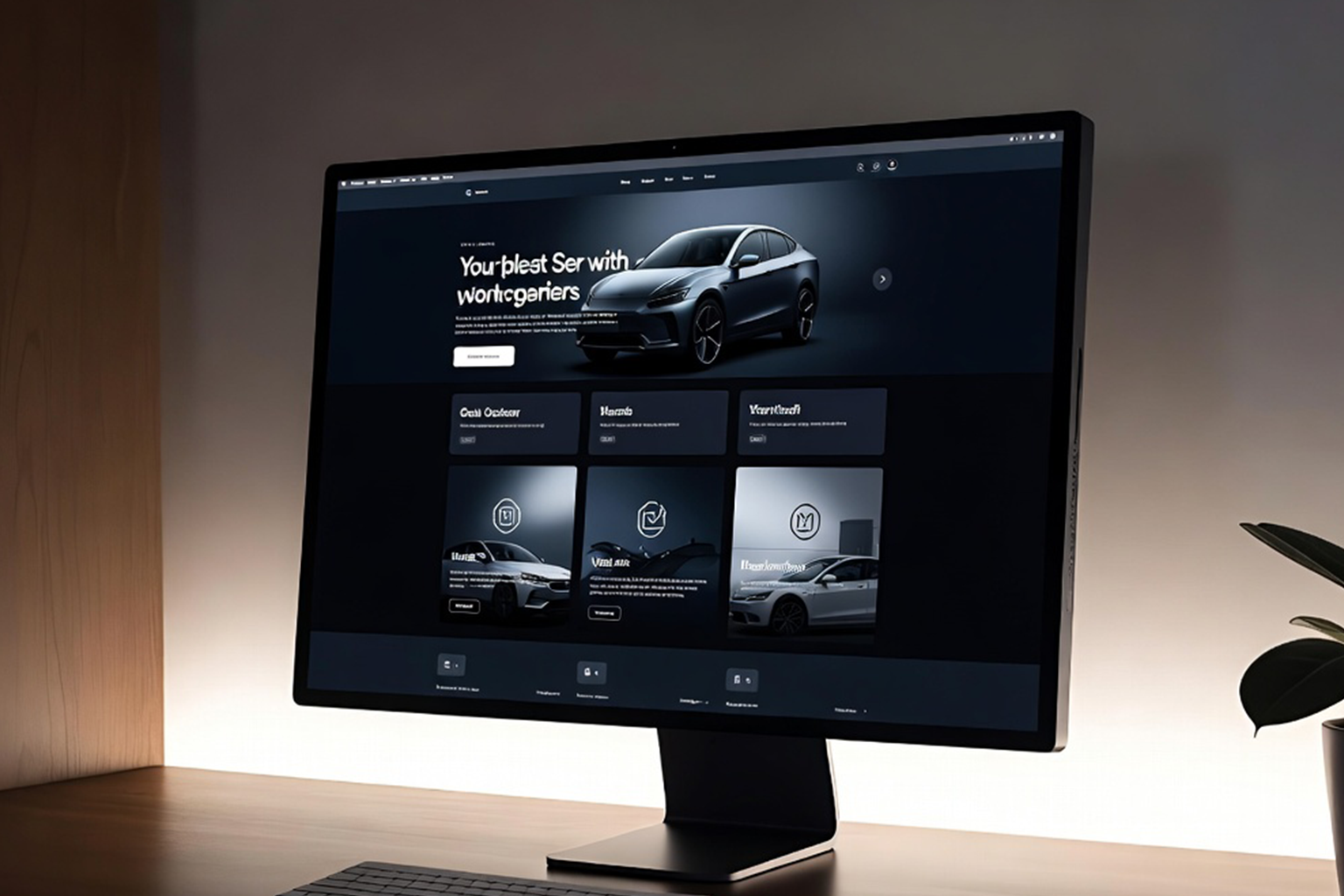
You have 50 milliseconds to make a first impression online. That is less time than it takes to blink. In that fraction of a second, a visitor to your website has already formed an opinion about your business, one that will colour every interaction that follows. Understanding what drives that snap judgment, and designing deliberately to control it, is not a cosmetic concern. It is a strategic one with direct consequences for your bottom line.
The psychological research on first impressions is unambiguous: people make rapid, emotionally-driven judgments about credibility, trustworthiness, and competence based almost entirely on visual cues. When those visual cues come from a website, design quality is the primary signal. A slow-loading page, an outdated layout, confusing navigation, or poor typography does not just feel bad, it actively destroys the trust your business has worked to build through every other channel.
At AG Art Studio, we have worked with businesses across industries and the pattern is consistent: a well-designed first impression does not just attract visitors, it converts them. Here is what the science and the data say about why first impressions matter so much, and what they mean for how your website should be built.
The psychology behind instant online judgments
The human brain is wired for rapid pattern recognition. When we encounter a new visual environment, a room, a face, a page, our brain processes its overall structure, contrast, colour, and spatial logic within the first few hundred milliseconds. This processing happens in the visual cortex before the analytical parts of the brain have even engaged. The result is an immediate emotional response that precedes conscious thought.
Research from Carleton University found that people can form a visual impression of a website in as little as 50 milliseconds, roughly 20 times faster than a conscious thought. That impression influences every subsequent interaction: how long they stay, how they interpret your content, whether they trust your pricing, and whether they contact you or a competitor. Crucially, the study also found that first impressions are strongly predictive of long-term opinion. If the initial impression is negative, users are unlikely to revise it, regardless of what the rest of the site contains.
Your website's design is not decoration, it is the first word you say to every potential customer. And in most cases, it is the only impression you get to make.
What visitors actually judge in those first 50 milliseconds
When researchers have studied what elements of a web page drive those instant visual impressions, the results are consistently dominated by the same factors. These are not the elements that most businesses focus on, the words, the offers, the case studies. They are the ambient signals of quality and trust that operate below conscious awareness.
The five moments where first impressions are made or broken
The loading experience
Before a visitor sees a single pixel of your design, they are already forming an impression from the loading experience. Research consistently shows that 53% of mobile users abandon a site that takes more than three seconds to load. That is not just a bounce, it is a negative first impression formed before any content has been seen. Speed is not a technical concern separate from design; it is the first design decision on your page, and one with enormous consequences for how many potential customers ever see what you have built.
The hero section
The area visible without scrolling, known as above the fold, is the most scrutinised real estate on your website. It needs to communicate three things instantly: what you do, who you serve, and why you are different. Businesses that use this space for vague headlines, generic stock photography, or unfocused messaging waste the most valuable first-impression opportunity available to them. The hero section is not a welcome mat, it is your opening argument, and it needs to be compelling enough that visitors choose to keep reading.
Navigation clarity
Within the first few seconds, visitors are scanning for signals that they are in the right place and that finding what they need will not require effort. A navigation structure that is clear, logically organised, and immediately understandable tells visitors that the business behind the site is organised and user-focused. Navigation that is crowded, confusingly labelled, or inconsistent between pages creates immediate friction and raises subconscious doubts about whether the business will be easy to work with in other contexts too.
Trust signals above the fold
Credibility cues need to appear early. Client logos, review scores, industry certifications, years in business, and media mentions are not just content, they are first-impression accelerators that move a visitor from uncertainty to confidence faster than any amount of well-written copy can. The placement of trust signals matters as much as their presence: a five-star review buried at the bottom of the page helps far less than the same information displayed prominently in the hero section where most visitors first look.
The mobile experience
Over 60% of web traffic globally now comes from mobile devices, and in many industries the proportion is significantly higher. A website that presents beautifully on desktop but is difficult to navigate, slow to render, or visually broken on mobile is delivering a negative first impression to the majority of its visitors. Mobile-first design is no longer a best practice, it is the baseline from which all web design decisions should begin, with desktop as the secondary consideration rather than the other way around.
The business cost of a poor first impression
First impressions are not merely aesthetic concerns, they have measurable consequences for revenue. Research from the Baymard Institute estimates that poor user experience, heavily influenced by first impression quality, contributes to over two trillion dollars in abandoned e-commerce transactions annually. For service businesses, the dynamics are similar: a visitor who forms a negative first impression of your website is far less likely to submit a contact form, request a quote, or pick up the phone, regardless of how competitive your pricing or how strong your track record.
How first impressions differ by industry
The visual signals that communicate credibility and trust are not universal, they are shaped by category expectations. Visitors arrive at websites with mental models built from their experience of other sites in the same industry, and they evaluate your site partly in comparison to those expectations.
| Industry | Primary trust signal | Most damaging first impression failure |
|---|---|---|
| Professional services | Polished, minimal design | Cluttered layout, outdated visuals |
| E-commerce | Clear product imagery, reviews | Slow load time, unclear returns policy |
| Restaurants & hospitality | High-quality food/venue photography | Poor mobile experience, no clear menu |
| Healthcare | Certifications, clean structure | Confusing navigation, no contact info |
| Creative agencies | Portfolio quality, design originality | Generic template, weak portfolio presentation |
What you can do right now
- Test your homepage load speed using Google PageSpeed Insights; aim for a mobile score above 85
- Read your hero headline aloud and ask: does a stranger instantly understand what we do and who we serve?
- View your homepage on three different mobile devices and check for layout breakages, text overflow, or slow image rendering
- Count the number of navigation items visible on load; more than seven is cognitively overloading for new visitors
- Check whether at least one credibility signal (review score, client logo, accreditation) is visible above the fold
- Assess your photography: are you using generic stock images, or images that reflect your actual team, products, or work?
- Ask someone unfamiliar with your business to spend five seconds on your homepage and then describe what you do; if they cannot, your first impression is failing
- Check that your colour palette, typography, and visual style are consistent across all pages; inconsistency undermines the professionalism of the first impression
The businesses that understand first impressions as a strategic variable, rather than an aesthetic preference, are the ones that extract the most value from every pound they spend driving traffic to their websites. A visitor who arrives, forms a positive first impression, and stays to engage is infinitely more valuable than a thousand visitors who arrive, judge negatively in under a second, and leave. The quality of that first impression is almost entirely within your control.
Research from Carleton University found that visual impressions of a website are formed in as little as 50 milliseconds, before conscious thought has even engaged. These impressions are predictive of longer-term opinion, meaning a poor first impression is very difficult to overcome with content quality alone.
Yes, significantly. Research consistently shows that 75% of users judge a company's credibility based on its website design. In sectors where customers cannot physically visit your premises before making a decision, professional services, online retail, consultancy, your website design is often the primary credibility signal available to them.
For most businesses, the above-the-fold hero section on mobile is the highest-leverage improvement available. Given that over 60% of traffic is mobile, and that visitors decide within seconds whether to stay or leave, a compelling, fast-loading, clearly communicating hero section on mobile has more impact than any other single design change.
An outdated website may appear to be working because you are not measuring what it is costing you: visitors who arrive, form a poor first impression, and leave without contacting you. These lost opportunities are invisible in your analytics unless you specifically track bounce rates, session durations, and conversion rates alongside traffic. Most businesses find that updating an outdated site significantly improves conversion rates even without any change in traffic volume.
A full redesign every three to five years is a reasonable baseline for most businesses, with smaller iterative improvements, updated photography, refined messaging, performance optimisations, on an ongoing basis. The clearest signal that a redesign is overdue is a rising bounce rate combined with declining conversion rates, particularly if competitors in your sector have recently updated their own sites.
A strong first impression will increase the likelihood that visitors engage long enough to discover your offering, but it cannot substitute for quality once that engagement begins. What a great first impression does is ensure that the quality of your work actually gets seen and considered, rather than being rejected before it has a chance to speak for itself. For businesses with genuinely strong products or services, a poor first impression is an avoidable and expensive barrier between their offering and the customers it deserves.