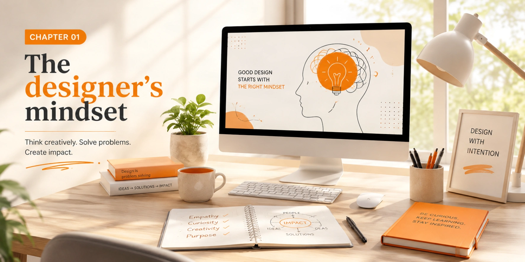
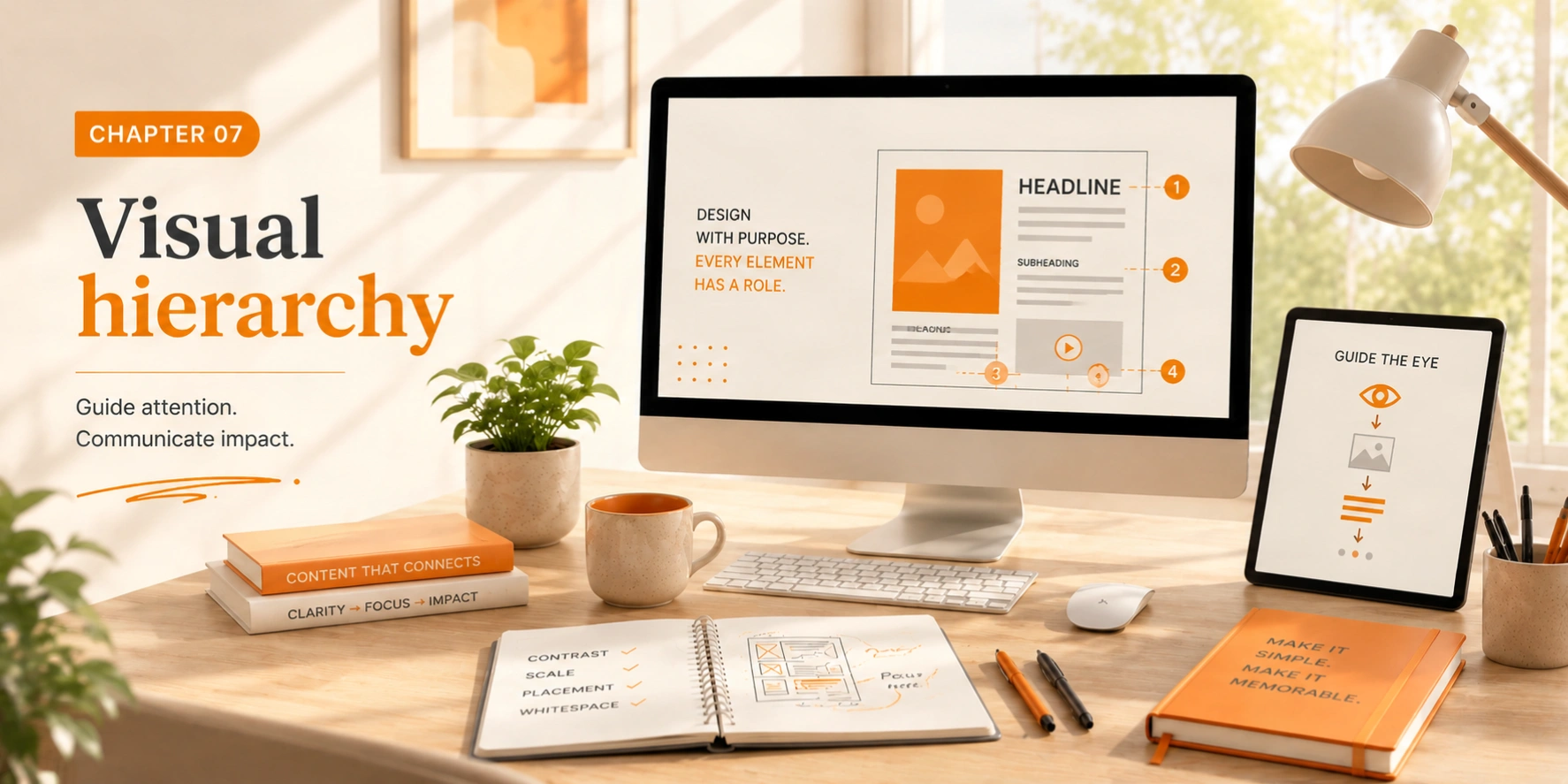
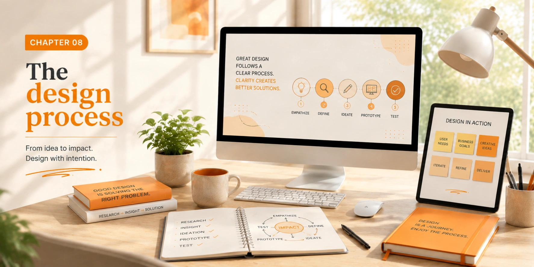
Principles
Pair a bold geometric shape with generous white space and a single accent color. Each element amplifies the others, the shape gains weight, the space gains purpose, the color gains impact. Restraint creates power.
Using all seven elements at maximum intensity simultaneously. When everything is emphasized, nothing is. Elements need contrast with each other to communicate effectively, not just contrast with the background.
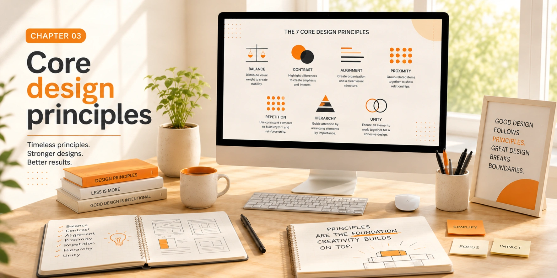
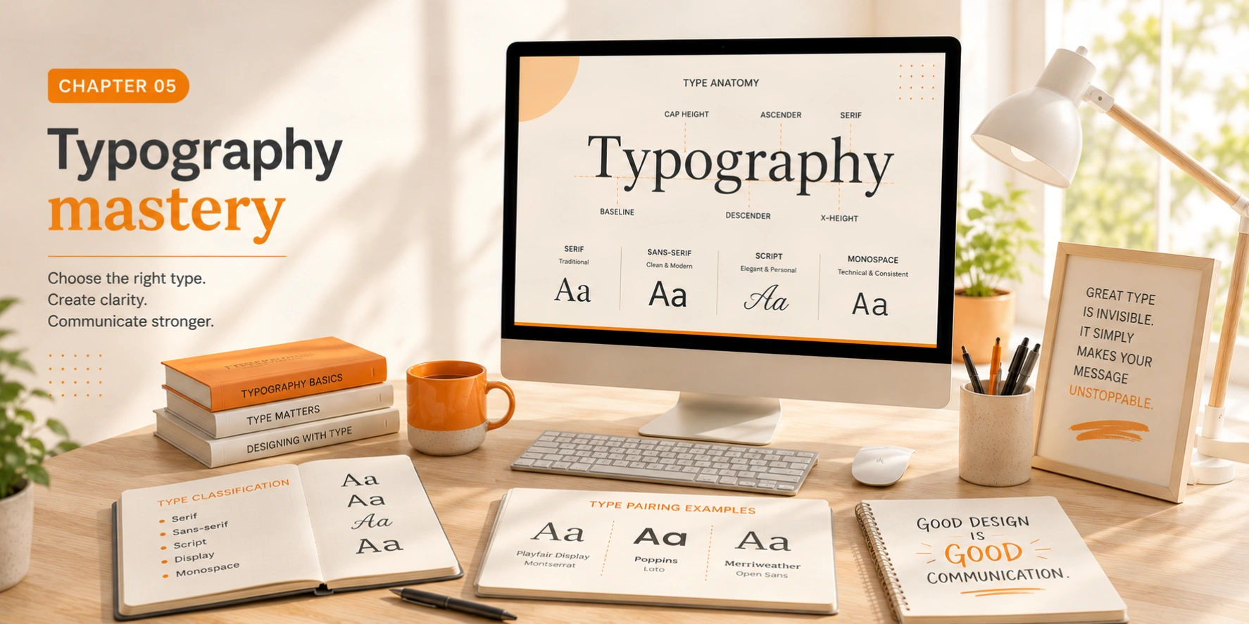
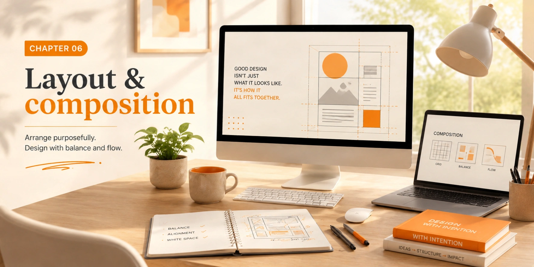
Give important elements twice the breathing room you initially think they need. The slight discomfort you feel looking at "too much" space usually means you've found exactly the right amount. Space is the luxury of confident design.
Filling every corner with content or decoration. Dense layouts overwhelm viewers, bury key messages, and signal design insecurity rather than richness. More content visible does not mean more information successfully communicated.
| Heuristic | What it means in practice |
|---|---|
| Visibility of system status | Always keep users informed about what's happening, including loading states,, confirmations, progress indicators. Never leave users wondering whether their action registered or was lost. |
| Match with real world | Use language and concepts users already know, not internal jargon or system terminology. Follow real-world conventions and mental models established outside your product. |
| User control & freedom | Provide clear undo, redo, and easy exits from unwanted states. Never trap users in flows they didn't intend to enter. Every action should be reversible where humanly possible. |
| Consistency & standards | Follow platform and industry conventions. Don't make users learn new interaction patterns for standard behaviors, as consistency reduces cognitive load significantly and builds trust through familiarity. |
| Error prevention | Design to prevent problems before they occur. Confirm destructive or irreversible actions, validate inputs in real-time, disable unavailable options. Prevention is always more valuable than recovery. |
| Recognition over recall | Minimize memory demands. Make options, actions, and information visible at the moment of need. Users shouldn't need to remember information from one step to successfully complete another. |
| Flexibility & efficiency | Provide keyboard shortcuts, saved preferences, and expert paths for experienced users while keeping the full interface fully learnable for first-time users. Excellent systems serve both audiences simultaneously. |
| Aesthetic & minimal design | Every element that isn't essential competes with the elements that are. Remove anything that doesn't serve a clear user need. Decoration is a form of noise. Beautiful noise is still noise. |
| Help recover from errors | Error messages must be in plain language, specific about what went wrong and constructive about what to do next. "Something went wrong" is never an acceptable error message for a professional product. |
| Help & documentation | Even brilliantly intuitive interfaces sometimes need help systems. Make help easy to find, task-focused, and concise. Users who reach help are already frustrated, and the help system must not add to that frustration. |
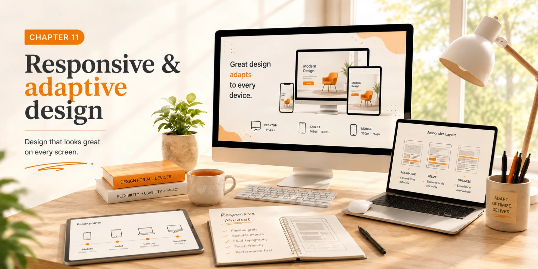
Start every screen design at 375px. If the experience works beautifully at the most constrained size, expanding it to desktop is straightforward. Constraints force ruthless clarity about what actually matters.
Designing a full desktop layout then "making it responsive" afterward. This approach almost always produces mobile experiences that feel like shrunken desktops rather than purpose-built mobile interfaces with their own logic and priorities.
STUDIO MAG

Core Web Vitals: What they actually mean for your business and why they matter
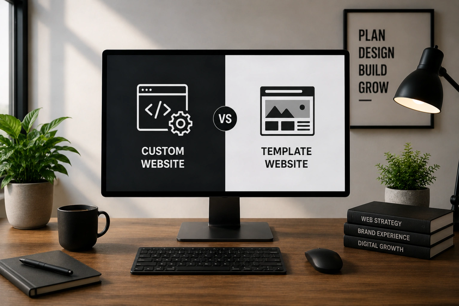
Custom Website vs. Template Website: Which build approach should your business actually invest in
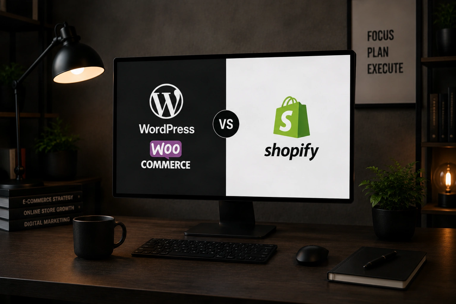
WordPress WooCommerce vs Shopify: Which E-commerce platform should your business actually choose
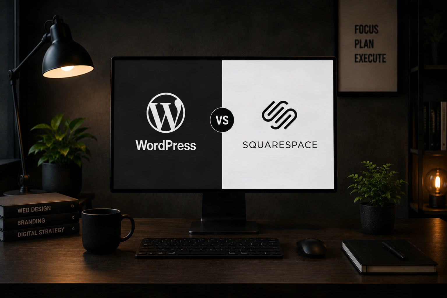
WordPress vs Squarespace: Which platform should your business actually choose
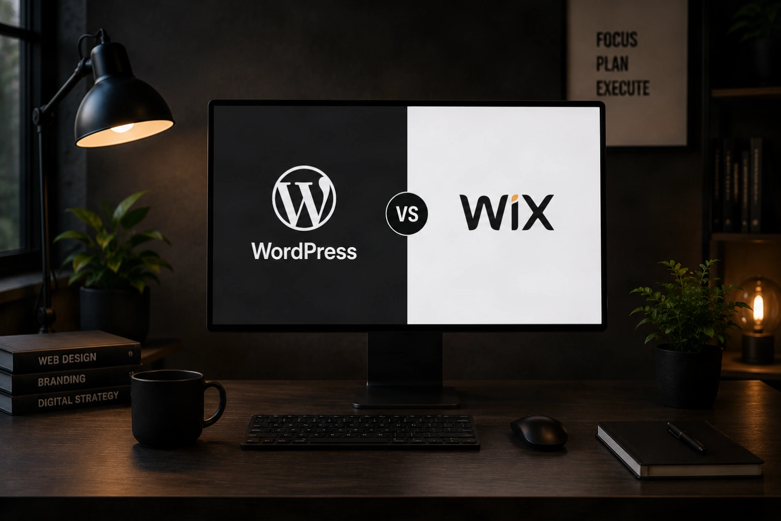
WordPress vs Wix: Which platform should your business actually choose
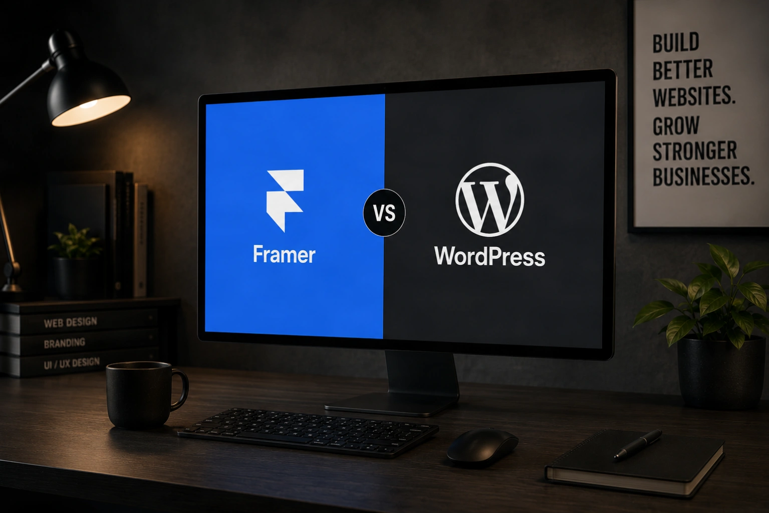
Framer vs WordPress: Which platform actually fits your business in 2026
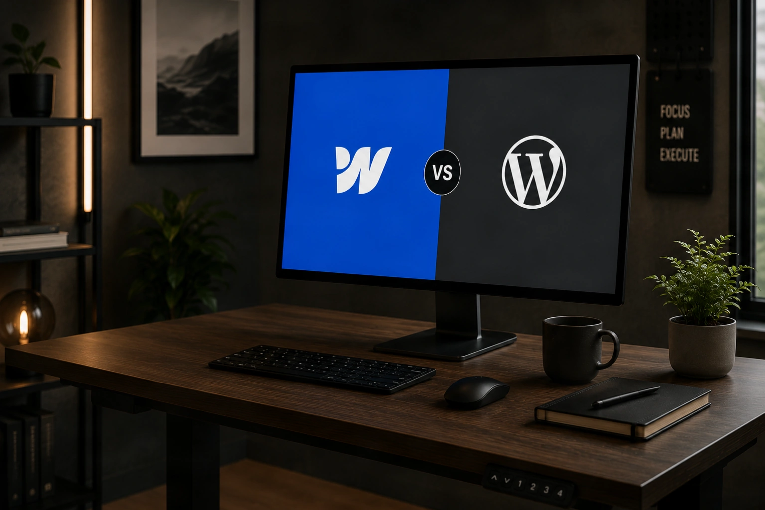
Webflow vs WordPress: Which platform actually fits your business in 2026
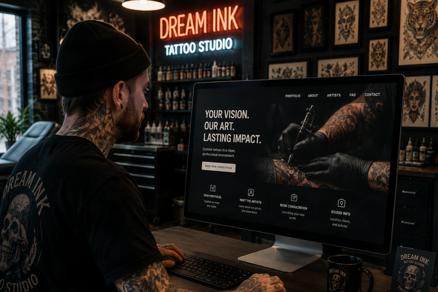
What a Tattoo Studio Website needs to do before a client ever picks up the phone
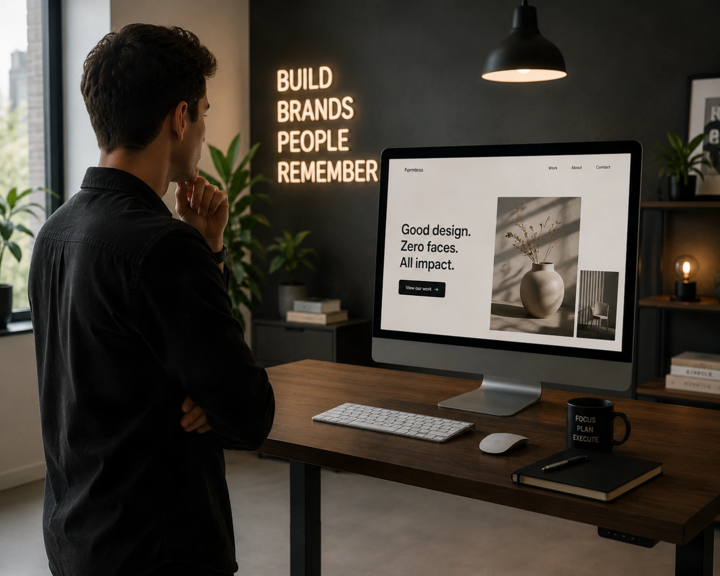
The rise of the faceless brand: why personality-led websites are winning