An e-commerce website that looks good but does not convert is an expensive disappointment. The difference between an online store that generates consistent revenue and one that accumulates traffic without sales almost always comes down to design; specifically, the dozens of small decisions that either reduce friction and build confidence or introduce doubt and send customers elsewhere.
E-commerce design in 2026 is more competitive than it has ever been. Consumers have been shaped by years of interactions with polished platforms like Amazon, Shopify storefronts, and direct-to-consumer brands that invest heavily in conversion optimization. The bar for what feels trustworthy and easy to buy from has risen accordingly. Understanding what actually drives conversions, beyond aesthetics, is the foundation of building an online store that performs.
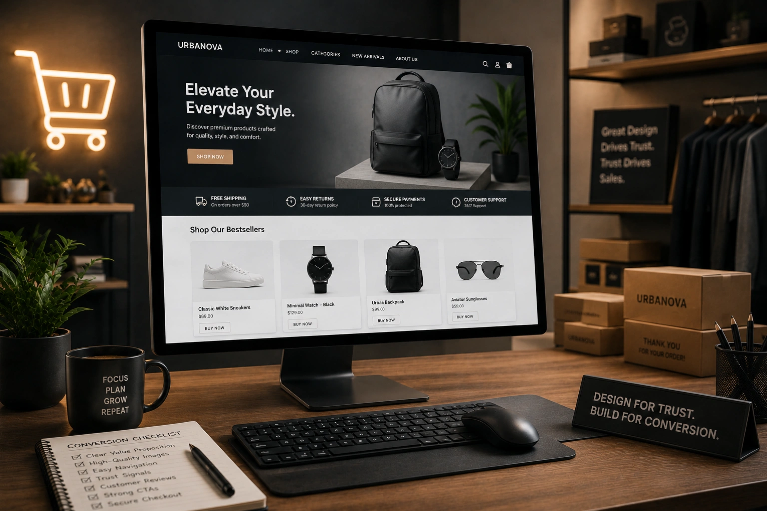
At AG Art Studio, we design e-commerce experiences that balance visual quality with conversion focus. Here is a comprehensive guide to the design decisions that separate high-converting online stores from the ones that leave revenue on the table.
Conversion starts before the product page
Most e-commerce conversion advice focuses on product pages and checkout flows. These matter enormously, but conversion begins much earlier; at the moment a visitor first lands on your store and decides whether it is worth exploring. Trust, clarity, and visual quality are established in the first few seconds, before a single product has been viewed.
A homepage that communicates your brand clearly, establishes credibility immediately, and makes navigation intuitive sets the conditions for conversion throughout the rest of the visit. A homepage that is cluttered, slow, or visually inconsistent damages the trust required for someone to enter their payment details, no matter how good the products are.
Product photography is your most important design asset
In a physical store, customers pick up products, inspect them from multiple angles, feel the texture, and read the label. Online, photography does all of that work. Poor product photography is the single most common reason visitors do not convert; if they cannot clearly see what they are buying, they will not buy it. High-quality product images on clean backgrounds, lifestyle shots showing the product in context, and multiple angles for each product are not luxuries; they are the minimum requirement for a credible online store in 2026.
The design implication extends beyond the images themselves. Product pages should be designed to showcase photography prominently, with large image displays, easy zoom functionality, and gallery navigation that allows visitors to move through multiple images without friction. The image area should be the dominant visual element on the product page; everything else, the price, the description, the add-to-cart button, supports it rather than competing with it.
The add-to-cart button must be impossible to miss
The primary call to action on every product page is the add-to-cart button. It should be visually dominant, consistently styled across the entire store, and positioned where the eye naturally lands after reviewing the product information. On desktop, this means prominently placed in the right column, visible without scrolling. On mobile, it should either be pinned to the bottom of the screen or positioned immediately below the product image and price. A button that blends into the page, requires scrolling to find, or looks similar to secondary actions is leaving sales unrealized.
Navigation and search must work flawlessly
A visitor who cannot find what they are looking for will not buy it. E-commerce navigation requires more careful design than a standard business website because the inventory complexity is higher and the paths to purchase are more varied. Category structures should be logical and match how customers think about products, not how the business organizes its inventory. Search functionality should be fast, tolerant of typos, and capable of returning relevant results even for partial queries. Filtering and sorting on category pages should allow customers to narrow large inventories quickly without feeling overwhelmed.
- Use customer-centric category names based on how shoppers describe products, not internal product codes or business terminology
- Make search prominent on every page; for stores with more than twenty products, search is often the fastest path to purchase and should be treated accordingly
- Implement filters that match genuine purchase decision criteria; size, color, price range, and material for apparel, for example
- Include breadcrumbs on all category and product pages so visitors always know where they are in the store structure
- Show product counts in categories so visitors can gauge inventory depth before clicking through
Trust signals must be woven throughout the journey
Entering payment information requires a level of trust that most e-commerce stores significantly underestimate. For new visitors with no prior relationship with a brand, every element of the purchase journey either builds or erodes that trust. Trust signals placed strategically throughout the store, not just on the checkout page, maintain confidence from the first landing to the final click of the purchase button.
Trust signals in e-commerce include customer reviews and ratings on product pages, security badges near the add-to-cart and checkout buttons, a clearly stated return policy visible before purchase, free shipping thresholds communicated prominently, recognizable payment method icons at checkout, and real contact information that confirms a human business stands behind the store. Each of these reduces a specific category of doubt; together they create the environment in which purchase feels safe.
The checkout flow must be as short as possible
Cart abandonment at checkout is one of the most studied problems in e-commerce, and the data is consistent: every additional step, every additional required field, and every unexpected cost at checkout reduces the number of purchases completed. The ideal checkout flow collects only the information genuinely required to fulfill the order, offers guest checkout without forcing account creation, displays shipping costs before the final step, and confirms the order clearly and immediately. Long, complex checkouts are one of the most reliably fixable sources of lost revenue.
Design decisions that consistently reduce checkout abandonment include showing a progress indicator so customers know how many steps remain, displaying order summary details persistently throughout the checkout process, pre-filling fields where browser autofill can help, validating form fields in real time rather than only after submission, and making it visually clear which fields are required versus optional. Each of these reductions in friction translates directly into a higher percentage of initiated checkouts reaching completion.
Mobile must be designed as the primary experience
More than half of e-commerce traffic now comes from mobile devices, and in many product categories that share is substantially higher. Yet mobile conversion rates consistently lag behind desktop, not because mobile shoppers are less willing to buy, but because most e-commerce sites deliver a noticeably worse experience on mobile than on desktop. Closing that gap is one of the highest-return improvements most online stores can make.
Mobile e-commerce design priorities include thumb-friendly add-to-cart and navigation targets, product images that display at full quality on small screens, a checkout flow optimized for touch input with appropriately sized fields and native keyboard types for each input, and a page speed that holds up on cellular connections. Product pages on mobile should be designed specifically for the mobile context; not simply reflowed from desktop layouts.
The best e-commerce design gets out of the way. It removes every possible reason not to buy, and makes the path from interest to purchase feel effortless.
Page speed is a conversion factor, not just an SEO factor
Google research found that a one-second delay in mobile load time reduces e-commerce conversions by up to 20%. This is not a marginal effect; it is a fundamental relationship between speed and willingness to purchase. A slow store creates doubt, signals poor quality, and tests the patience of visitors who have alternatives a back-button press away. E-commerce sites, which typically carry more page weight than standard business websites due to product images and third-party payment scripts, need to be actively managed for performance rather than left to accumulate bloat over time.
E-commerce design audit: where to look first
Your homepage- Does it communicate what you sell and who it is for within five seconds?
- Is there a clear path from the homepage to your most popular or highest-margin products?
- Are trust signals present above the fold or immediately below it?
- Are product images large, high-quality, and shown from multiple angles?
- Is the add-to-cart button prominent, consistently styled, and visible without scrolling on mobile?
- Are customer reviews displayed on the product page with genuine ratings and written feedback?
- Is the return policy, shipping estimate, and any guarantee visible before the purchase decision is made?
- Is guest checkout available without requiring account creation?
- Are shipping costs shown before the final checkout step?
- Is the form as short as possible; collecting only what is genuinely needed?
- Are security badges and payment method icons visible at the point of payment?
- Is the order confirmation clear, immediate, and followed up by a confirmation email within minutes?
- Do product images display at full quality on a 375px screen?
- Are all tap targets at least 44 by 44 pixels and clearly spaced?
- Does the site load in under three seconds on a mobile connection?
- Is the checkout form optimized for touch input with appropriate keyboard types?
Converting a higher percentage of the visitors already arriving at your store is almost always more cost-effective than acquiring more traffic. A store converting at 1% that improves to 2% doubles its revenue from the same traffic without spending an extra dollar on marketing. The design improvements that drive that change are achievable, measurable, and compound over every visitor the store receives from the day they are implemented.