Two of the most powerful aesthetic directions in web design sit at opposite ends of the same spectrum. Minimalism strips everything away until only the essential remains. Maximalism embraces richness, complexity, and visual abundance. Both are legitimate strategies; both are capable of producing exceptional websites. The question is not which is better in the abstract, but which is right for your brand, your audience, and your goals.
The debate between minimalism and maximalism in web design is often framed as a taste argument, as though the choice were simply a matter of personal preference. In practice, it is a strategic one. The aesthetic approach of a website communicates something about the brand behind it before a single word is read; and those first-impression signals need to match what the brand actually stands for, what its audience expects, and what emotional state the design needs to create to facilitate conversion.
At AG Art Studio, we have designed websites across the full spectrum of aesthetic approaches, and we have seen both succeed brilliantly and both fail badly, depending on how well the choice was made. Here is a comprehensive look at both philosophies, their real strengths and limitations, and a practical framework for deciding where your brand belongs.
Defining the two approaches honestly
Before comparing them, it helps to define each approach accurately, because both are frequently misunderstood in ways that lead to poor design decisions.
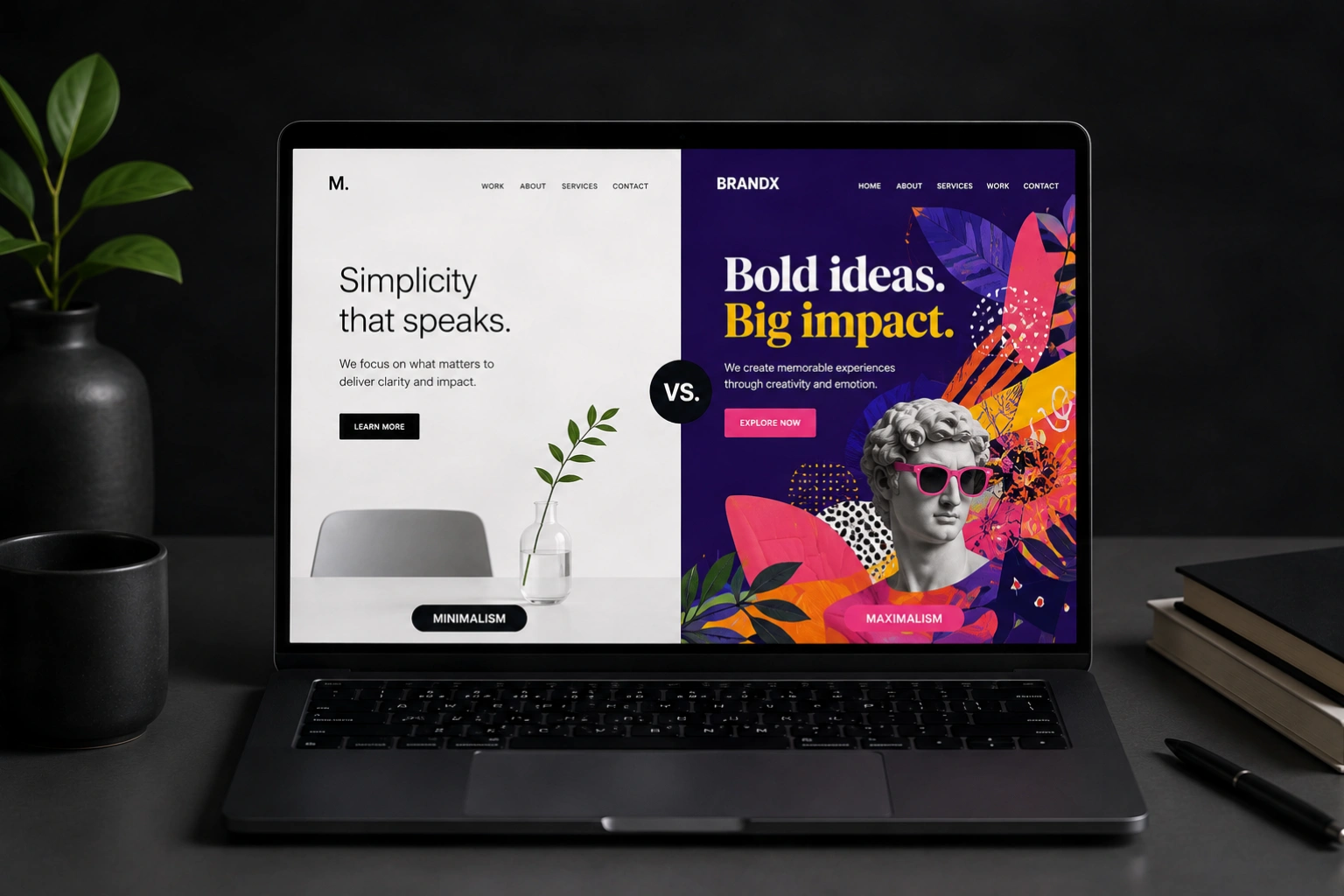
Minimalism in web design is not simply the absence of elements. It is the discipline of including only what is necessary and ensuring that everything included is there for a reason. A minimalist website is not bare because there was nothing to add; it is restrained because the designer made active choices to remove everything that did not serve the user's experience or the brand's communication goals. Done well, minimalism communicates confidence, clarity, and respect for the visitor's time and attention.
Maximalism in web design is not chaos or clutter. It is the deliberate use of richness, density, and visual complexity to create an immersive, expressive experience. A maximalist website does not pile elements together carelessly; it orchestrates them with intention, using layering, contrast, and visual hierarchy to create a sense of abundance that feels curated rather than overwhelming. Done well, maximalism communicates energy, personality, and creative confidence.
respects silence.
The real strengths of minimalist web design
Speed and performance
Minimalist websites are almost always faster than maximalist ones, because fewer elements means less to load. Fewer images, fewer fonts, fewer animation libraries, and less JavaScript produce pages that load faster, score better on Core Web Vitals, and rank higher in search. For businesses where SEO performance is a priority, the performance dividend of a restrained design approach is a genuine competitive advantage that compounds over time.
Focus and conversion clarity
When there is less competing for a visitor's attention, the elements that remain carry more weight. A single call-to-action button on a clean page is vastly more visible and persuasive than the same button surrounded by competing visual elements. Minimalist design creates a hierarchy by subtraction; removing distractions rather than adding emphasis. For websites where a specific conversion action is the primary goal, this clarity is a significant advantage.
Longevity and timelessness
Minimalist designs tend to age more gracefully than maximalist ones. Trends in color, typography, illustration style, and interface complexity shift constantly; and a website that is built around those trends feels dated within a few years. A restrained, principled minimalist design that is well-executed can feel as contemporary in five years as it did at launch. For businesses that update their websites infrequently, this longevity has real practical value.
- Luxury and premium brands where restraint signals exclusivity
- Professional services where trust and credibility are paramount
- SaaS and technology products with complex functionality
- Healthcare, legal, and financial services
- Businesses prioritizing SEO and conversion rate
- Brands with a long intended website lifespan
- Creative agencies, studios, and bold consumer brands
- Fashion, music, entertainment, and cultural brands
- Brands targeting younger, design-literate audiences
- Businesses where visual distinctiveness is a competitive advantage
- Event-based or campaign-driven websites with short lifespans
- Brands that want to signal creative confidence above all else
The real strengths of maximalist web design
Memorability and distinctiveness
In a landscape where most websites follow the same clean, minimal template, a maximalist site is immediately and powerfully distinctive. The richness and visual confidence of a well-executed maximalist design is difficult to forget; and in competitive markets where brand recall plays a role in purchasing decisions, being memorable is a genuine business advantage. A visitor who has seen fifty similar minimal sites and then encounters one that is bold, expressive, and visually surprising is unlikely to forget which brand it belonged to.
Emotional impact and brand personality
Maximalist design has a greater capacity to evoke strong emotional responses than minimalist design, because it gives more sensory information to respond to. Color, texture, motion, typography, illustration, and layered imagery all contribute to an emotional atmosphere that a sparse design simply cannot create. For brands whose relationship with their audience is built on passion, community, or shared cultural identity, this emotional richness is not a luxury; it is the primary medium through which the brand communicates its values.
Social sharing and content virality
Maximalist websites are significantly more likely to be shared, screenshotted, and featured in design publications than minimal ones, because they provide more visually interesting content to respond to. For brands in creative industries where digital word-of-mouth and design community recognition are meaningful, a maximalist approach can generate organic attention that a minimal site simply would not. The website becomes a piece of content in its own right, not just a container for other content.
The best design choice is not the most beautiful one in isolation. It is the one that most accurately reflects who the brand is and what its audience needs to feel in order to trust and engage with it.
The design spectrum: it is not binary
The minimalism-maximalism dichotomy is useful as a conceptual frame, but in practice most effective websites sit somewhere between the two poles rather than at either extreme. The most interesting and often the most effective design work happens in the territory between them, where a restrained layout is given personality through bold typography, where a rich visual language is organized by a clear underlying grid, or where a single expressive element anchors an otherwise simple composition.
The web design aesthetic spectrum
The brands that land in the middle of this spectrum, the "balanced" and "expressive" zones, often produce the most broadly admired web design. They have enough visual interest to feel distinctive and energetic, and enough structure to feel trustworthy and easy to navigate. The key is that the position on the spectrum is chosen deliberately based on brand strategy rather than defaulting to one end because it is easier or more familiar.
How to decide where your brand belongs
The decision is not ultimately about aesthetic preference. It is about four factors that, taken together, point clearly toward the right position on the spectrum for your specific brand.
Your audience's aesthetic expectations
Different audiences have internalized different aesthetic norms and use them as trust signals. A premium financial services client expects clean, restrained design; a maximalist site in that context would feel unprofessional and raise doubt. A fashion-forward consumer brand targeting Gen Z expects energy, boldness, and visual risk; a minimal site in that context might feel timid or out of touch. Understanding the aesthetic vernacular of your specific audience is the starting point for any design direction decision.
Your competitive landscape
If every competitor in your market has a clean, minimal site, a maximalist approach can be a powerful differentiator. If your market is populated by visually expressive brands, a more restrained approach might stand out through its confidence and clarity. The most valuable aesthetic decision is often not the most popular one in your category, but the one that is most distinctively yours within a landscape where everything else looks similar. Mapping your competitors' visual approaches before making your own decision is always time well spent.
Your primary conversion goal
If the primary purpose of your website is to generate leads, appointments, or purchases, the design approach that best supports that conversion goal is the right one, regardless of aesthetic preference. Conversion-focused design almost always benefits from clarity, hierarchy, and reduced distraction, which tends to favor the minimalist end of the spectrum. If the primary purpose is to establish brand identity, generate awareness, and create an emotional connection, the expressive and maximalist end of the spectrum is more likely to deliver those outcomes.
Your brand's genuine personality
The most important and the most frequently ignored factor in this decision is authenticity. A maximalist design for a brand that is fundamentally quiet and precise will feel performative and unconvincing. A minimal design for a brand that is fundamentally bold and expressive will feel like a suppression of its natural voice. The design approach should feel like the brand's natural aesthetic register, not an aspiration or an imitation. When design and brand personality are genuinely aligned, the website feels coherent and trustworthy in a way that no amount of visual quality can compensate for if they are not.
- Look at three to five brands your target audience admires; what do their websites have in common aesthetically?
- List five adjectives that describe your brand's personality; do they lean toward restrained or expressive?
- What is the primary action you want visitors to take on your website; does it benefit more from clarity or from emotional impact?
- Map your three closest competitors; where do they sit on the minimalism-maximalism spectrum, and is there an unclaimed position you could own?
- How long do you intend to keep this website before a significant redesign; longer lifespans favor more restrained approaches
- How important is mobile performance and SEO to your growth strategy; these factors favor leaner, more minimal approaches
- Is your brand primarily defined by what it says or by how it makes people feel; feeling-first brands benefit more from maximalist expressiveness
The minimalism-maximalism debate is ultimately a proxy for a deeper question: what does your brand need to communicate, and what is the most effective visual language for communicating it? Answering that question honestly, based on your audience, your competitive landscape, your business goals, and your brand's genuine personality, produces a design direction that is both strategically sound and aesthetically coherent. The result is a website that does not just look good in a designer's portfolio; it works in the specific market it is designed for, with the specific audience it is designed to reach.