Dental anxiety is real, documented, and widespread. Studies suggest that between 50 and 80 percent of adults experience some level of anxiety about dental visits, and a significant proportion avoid treatment entirely because of it. Your website is the first encounter a new patient has with your practice, and it is doing one of two things: either it is reducing that anxiety by communicating safety, competence, and warmth before they have ever met you, or it is amplifying it through clinical coldness, confusing navigation, or a design that feels dated and impersonal. The difference between those two outcomes is design.
Dental practices face a unique web design challenge: they need to communicate clinical credibility and technical expertise while simultaneously feeling welcoming, human, and reassuring to an audience that is, at least partly, predisposed to find the whole subject stressful. Generic healthcare web design gets the clinical part right and fails at the human part. Generic small business web design gets the warmth right and fails at the trust. A well-designed dental website needs to achieve both simultaneously.
At AG Art Studio, we have designed websites for dental practices ranging from single-chair independent practices to multi-site groups. Here is the complete framework for what works, what does not, and what the data says about how new patients evaluate dental websites before booking their first appointment.
Understanding the dental patient's decision-making journey
A person searching for a new dentist is almost always in one of three situations: they have recently moved and need to register with a new practice, they are dissatisfied with their current practice and are looking for an alternative, or they have a specific treatment need and are evaluating their options. In each case, the primary emotional driver is a combination of anxiety reduction and trust building. They are not shopping for the cheapest option or the most technically impressive treatment list. They are looking for a practice where they will feel safe, where they will be treated by competent and caring professionals, and where the experience will be as manageable as possible.
Every design decision on a dental website should be evaluated against that emotional reality. Does this element reduce anxiety or increase it? Does it build trust or create doubt? Does it make taking the next step feel easier or harder? These are the questions that distinguish dental websites that consistently generate new patient bookings from those that look professional but underperform.
A dental website is not selling a service. It is making a promise: that this will be okay, that you will be looked after, and that you will leave better than you arrived. Everything on the page should be working towards that promise.
The six design principles that define high-converting dental websites
Warmth before clinical authority
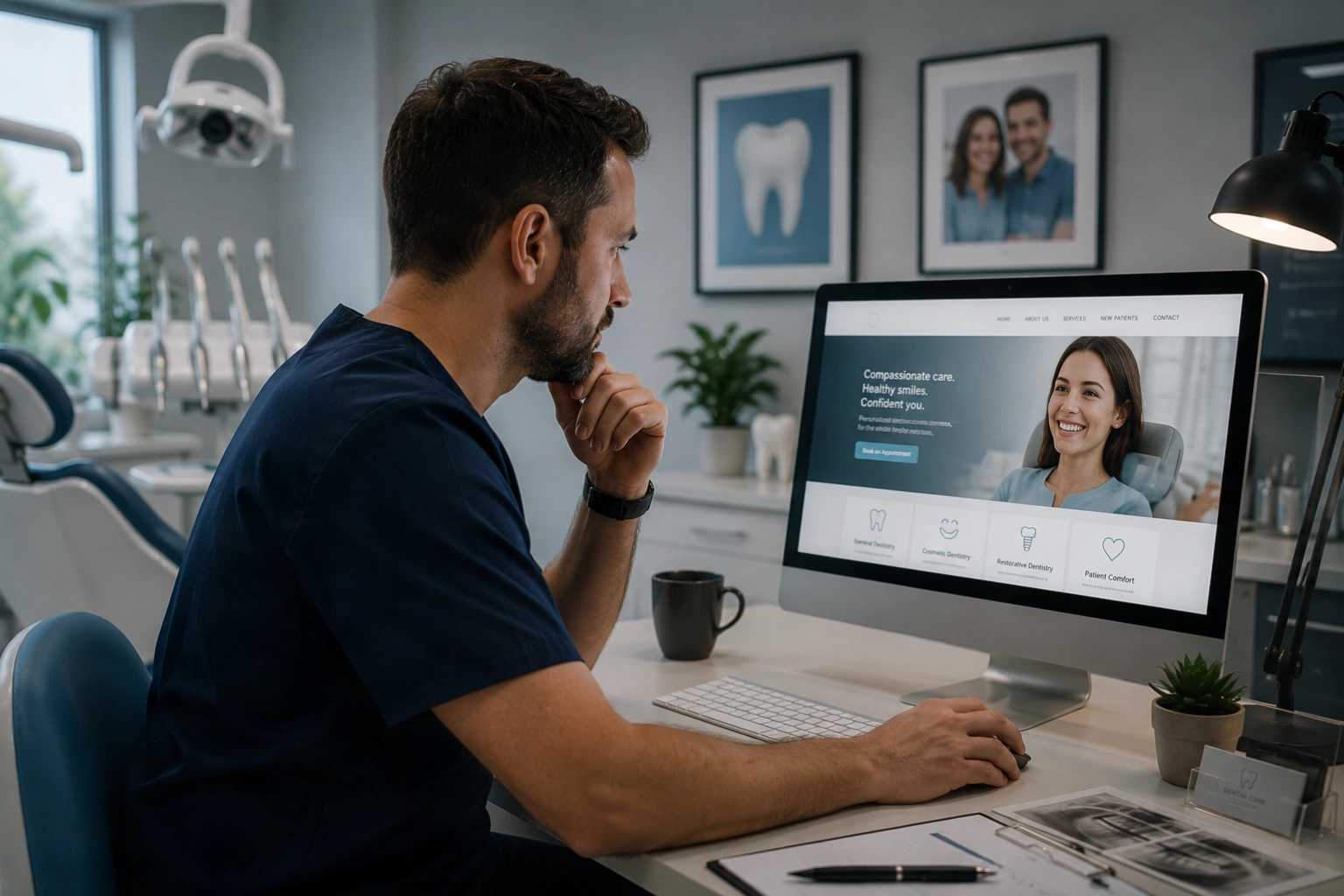
Most dental websites lead with the practice's clinical credentials, treatment lists, and technology. These are relevant, but they are not what a new patient needs to see first. The opening experience of a dental website needs to communicate warmth, approachability, and genuine care before it introduces qualifications and equipment. A hero section featuring a genuine photograph of your team smiling, a headline that speaks to how the patient will feel rather than what the practice offers, and a tone that is reassuring rather than clinical sets the right emotional foundation for everything that follows. Credentials and technology are supporting content that reinforces a trust already established, not the lead argument.
Online booking that is genuinely frictionless
The moment a patient decides they want to book should be matched by an immediate, effortless path to doing so. An online booking button that is visible without scrolling on every page, particularly on mobile, is the single highest-impact conversion element on a dental website. The booking process itself should require as few steps as possible: ideally selecting a treatment category, choosing an available time, and entering contact details. Every additional step in the booking flow reduces completion rates. If your practice management system supports real-time availability through an integration, implement it; patients who can see and select a specific time slot convert at significantly higher rates than those directed to a contact form to request a callback.
Team profiles that create human connection
Patients choose dentists, not practices. The knowledge that they will be treated by a specific person they have already been introduced to, however briefly, significantly reduces new patient anxiety. Every dentist and hygienist should have a dedicated profile page featuring a genuine, approachable photograph, their name and qualifications in plain language, a description of their clinical interests and the types of patients they particularly enjoy working with, and a personal detail or two that makes them feel like a real person rather than a credential list. A short video introduction, even thirty seconds filmed on a phone with good lighting, is one of the highest-conversion elements available on a dental website and remains surprisingly rare.
Treatment pages written for patients, not peers
Each treatment your practice offers deserves its own dedicated page, written in plain language for a patient who may know nothing about dentistry. A page for composite bonding should explain what it is, what problem it solves, what the experience is like, how long it takes, how long it lasts, and roughly what it costs, before presenting any clinical detail. Patients searching for cosmetic treatments are often motivated by specific self-consciousness about a particular issue; pages that open by describing the situation the patient is in, rather than the clinical procedure, convert significantly better than technically accurate but emotionally disconnected treatment descriptions. Photographs of actual patient results from your own practice, with appropriate consent, are the most persuasive content element available on any treatment page.
Social proof positioned at the moment of decision
Patient reviews are the most powerful trust signal available to a dental practice, and their placement matters as much as their content. Reviews that describe a specific experience, name the dentist they saw, and address the anxiety a new patient might be feeling are far more valuable than generic five-star ratings. These should appear on treatment pages alongside the relevant treatment, on the homepage near the primary call to action, and on any page designed to convert new patient enquiries. A star rating widget that pulls live from Google or a review platform, displayed prominently in the header or hero section, is one of the most credible and visible trust signals available. Video testimonials from genuine patients, particularly those who came in with anxiety and left reassured, convert extremely well when used on the homepage.
Dedicated anxiety and nervous patient content
Given the prevalence of dental anxiety, a dental website that does not explicitly address it is failing a significant portion of its potential patient base. A dedicated page or prominent section for nervous patients that acknowledges anxiety openly, describes the specific measures the practice takes to make anxious patients comfortable, and includes testimonials from patients who came in anxious and had a positive experience, directly addresses the barrier that prevents the highest-need patients from booking. This content also performs well in local search, as nervous patients specifically search for terms like "nervous patient dentist" and "dental anxiety" alongside their location, and a practice that has relevant content for those queries captures a high-intent audience that competitors without that content entirely miss.
Essential pages for a dental practice website


Design elements that reduce anxiety and increase bookings
| Design element | Anxiety impact | Booking impact | Priority |
|---|---|---|---|
| Genuine team photography | Significantly reduces; makes the practice feel human | High; patients book people they feel they know | Essential |
| Online booking above fold | Reduces; removes the barrier of having to call | Very high; direct path to conversion | Essential |
| Patient video testimonials | High reduction; peer reassurance is the strongest available | High; particularly for cosmetic treatments | High |
| Practice tour video or photos | Moderate reduction; familiarity reduces anxiety | Medium; reduces unknown factor of the environment | High |
| Transparent pricing | Neutral to positive; removes cost uncertainty | High; reduces qualified-patient hesitation | High |
| Before and after gallery | Neutral; relevant for cosmetic treatments specifically | Very high for cosmetic; moderate for general | Medium |
| Stock clinical photography | Increases; generic imagery feels impersonal | Low; fails to create human connection | Avoid |
Mobile design priorities for dental websites

Over 65% of dental website traffic comes from mobile devices, and the vast majority of that traffic consists of people in a moment of decision: they are looking for a dentist, they have found your site, and they are deciding in the next thirty seconds whether to book or keep searching. The mobile experience is not a secondary consideration for dental websites; it is the primary one.
- Homepage hero section leads with warmth and patient experience, not treatment lists or clinical credentials
- Online booking button is visible above the fold on mobile without scrolling
- Every dentist and hygienist has an individual profile page with genuine photography and a personal description
- Every treatment has its own dedicated page written in plain language from the patient's perspective
- A dedicated nervous patient page exists and is easy to find from the main navigation
- Patient review score and a selection of specific named reviews are visible on the homepage
- Before and after photographs from real patients are present on all cosmetic treatment pages
- Fee information is published for all treatments, or at minimum a clear guide price and explanation of how costs are determined
- Phone number is a tappable link on every page and visible without scrolling on mobile
- The site loads in under three seconds on mobile as measured by Google PageSpeed Insights
- A new patient page explains exactly what to expect at a first visit and removes the unknowns that deter anxious patients
- The practice address and a Google Maps link are easily findable without navigating to the contact page
A dental website designed around the patient's emotional journey, not the practice's service list, consistently outperforms one designed the other way around. The practices that generate the most new patient bookings from their websites are those that have made a genuine investment in communicating warmth, safety, and competence in equal measure, and that have removed every unnecessary barrier between a potential patient's first impression and their first appointment.
Yes, and for most treatments this is straightforwardly beneficial. Patients who find and book based on visible pricing are self-qualified and significantly less likely to be deterred by cost at the appointment stage. Practices that hide pricing create a barrier for the price-conscious patients most likely to be put off by an unexpected quote, while doing nothing to attract the patients who would book regardless. For treatments with highly variable costs, publishing a starting price or price range with an explanation of what affects the final cost achieves the same transparency benefit while honestly representing the variability.
The most widely used dental practice management systems in the UK with online booking integration capability include Dentally, SOE Exact, Carestream Dental, and Sensei Cloud. Each offers varying degrees of real-time availability display and booking flow customisation. The most important criterion when evaluating booking integration is how closely the patient-facing booking experience matches your website's design and how few steps are required to complete a booking. A booking flow that opens in a branded modal window within your site converts better than one that redirects to a separate third-party platform with different branding.
For practices offering cosmetic dentistry, including teeth whitening, composite bonding, veneers, Invisalign, and smile makeovers, a before and after gallery is one of the highest-converting elements on the site. Patients considering cosmetic treatment are highly visual in their decision-making; seeing genuine results from real patients in comparable starting situations is the most direct evidence available that you can achieve the outcome they are looking for. The gallery should use real patient photographs from your own practice with proper consent, never stock imagery, and should ideally be filterable by treatment type so patients can find examples relevant to their specific concern.
The most effective approach is a systematic post-appointment follow-up process. Send a personalised text or email to every patient within 24 hours of their appointment thanking them for visiting and including a direct link to your Google review page. The timing matters: patients are most satisfied and most willing to leave a review in the immediate aftermath of a positive experience. Many dental practice management systems can automate this process. A QR code displayed at reception that links directly to your review page captures patients who prefer to act in the moment. Never offer incentives for reviews, as this violates Google's guidelines and can result in your profile being penalised.
The core design principles are the same: trust, warmth, clear information, and frictionless booking. The content priorities differ. An NHS practice website needs to clearly communicate NHS registration availability, what is and is not covered by NHS treatment, and how the NHS charge bands work, as these are among the most common questions from patients considering registration. A private practice website will place more emphasis on treatment quality, the range of cosmetic options available, payment plan flexibility, and the premium experience differentiators that justify private fees. A mixed NHS and private practice needs to clearly separate and explain both pathways so patients of either type can quickly understand what applies to them.
The most effective dental website palettes combine the clinical credibility signals of clean whites and soft blues with the warmth of a humanising accent colour. A pure white or off-white base communicates cleanliness and professionalism. Soft teal or light blue accents carry healthcare trust associations without feeling cold. A warm accent such as a muted gold, soft terracotta, or sage green introduces the approachability and human warmth that pure clinical palettes lack. The palettes to avoid are those that feel aggressive or high-anxiety: saturated reds, very dark colour schemes, and palettes with no warm elements at all tend to amplify rather than reduce the anxiety that is already a barrier for many potential patients.