Every color choice, every font, every layout decision on your website is communicating something to your visitors, whether you intended it or not. The field of web design psychology shows us that these signals are processed before conscious thought; they shape trust, appetite, and purchase intent in ways most business owners never consider. Understanding them gives you a genuine competitive edge.
Design is often discussed as though it were purely aesthetic; a matter of taste, trend, or personal preference. In reality, the elements of visual design trigger deeply ingrained psychological responses that influence how people feel, what they trust, and what they decide. These responses are not random; they are predictable, measurable, and actionable. The business that understands them designs with intention. The one that does not designs by accident.
At AG Art Studio, we approach every design decision as a communication decision. Here is a practical guide to the psychology behind the visual choices that shape how your website visitors think, feel, and behave.
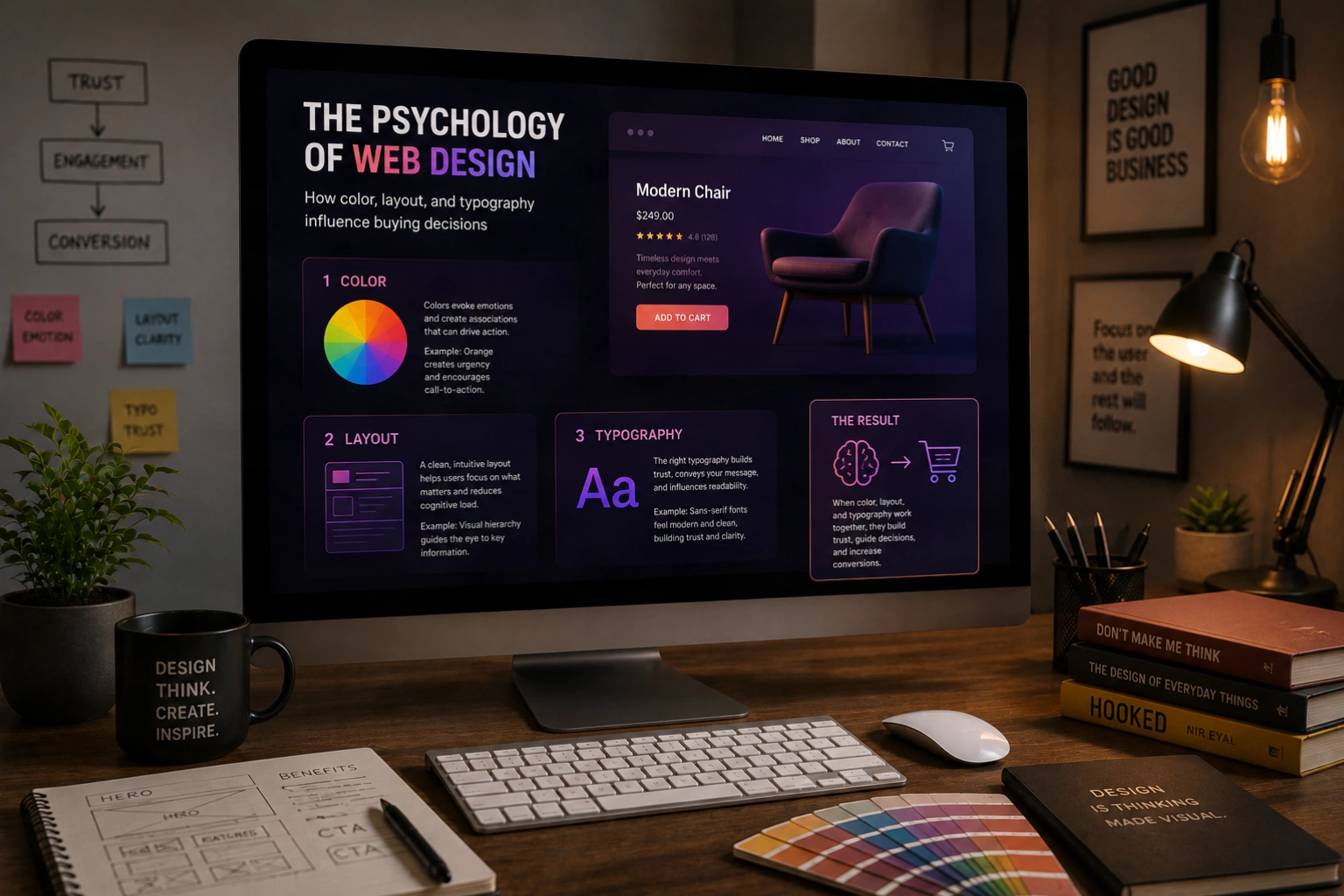
The psychology of color in web design
Color is the most immediate and powerful psychological tool available to a designer. Before a visitor reads a single word on your website, color has already communicated something about your brand; its energy, its trustworthiness, its positioning. These associations are partly cultural, partly biological, and deeply consistent across large populations. Ignoring them does not make them go away; it simply means your color choices are working against you rather than for you.
Blue: trust, reliability, and calm authority
Blue is the most universally trusted color in web design. It is the dominant choice for financial institutions, healthcare providers, technology platforms, and professional services for a reason: it consistently communicates reliability, competence, and calm authority. Studies show that blue increases feelings of trust and security, which is why so many brands that ask visitors to enter sensitive information, whether payment details, medical records, or personal data, default to blue as their primary color. Its risk is blandness; used without care, blue reads as generic rather than trustworthy.
Orange and red: urgency, energy, and appetite
Warm colors accelerate decision-making. Orange conveys enthusiasm, confidence, and approachability; it is the most consistently high-performing color for call-to-action buttons across e-commerce research. Red creates urgency and heightened arousal, which is why it appears so frequently in sale announcements, countdown timers, and error states. Both colors stimulate appetite, which explains their dominance in food and hospitality branding. The psychological risk is overuse; warm accents perform best when used sparingly against neutral or cool backgrounds, where contrast amplifies their effect.
Green: growth, health, and permission
Green carries associations with nature, health, sustainability, and financial growth, the last of which explains its consistent use in fintech and investment platforms. It is also the color most strongly associated with permission and safety; green checkmarks, green confirmation buttons, and green success messages all leverage the deeply ingrained "green means go" conditioning. For brands in health, wellness, sustainability, or finance, green is often the psychologically most accurate choice, provided it is used with sufficient sophistication to avoid reading as generic.
Black and dark palettes: premium positioning and confidence
Dark backgrounds and high-contrast palettes signal premium positioning, sophistication, and editorial confidence. Luxury fashion, high-end hospitality, creative agencies, and technology brands at the premium end of the market consistently gravitate toward dark aesthetics. The psychology is rooted in exclusivity; dark palettes feel considered, deliberate, and less accessible in ways that reinforce premium pricing. The design challenge is execution: dark palettes require careful attention to contrast, typography legibility, and the quality of imagery, which must be significantly higher to hold up against a dark background.
Color is not decoration. It is a signal your brand sends before a single word is read; and visitors process it and respond to it whether they are aware of it or not.
The psychology of layout and visual hierarchy
How a page is structured shapes what visitors notice, in what order, and how they feel about what they find. Visual hierarchy is the designer's primary tool for guiding attention; and attention, in a world of competing distractions, is the scarcest resource your website has to work with.
The F-pattern and Z-pattern: how eyes move across a page
Eye-tracking research has consistently shown that web users scan pages in predictable patterns rather than reading them linearly. On text-heavy pages, the F-pattern dominates: visitors read across the top, scan down the left edge, and read partway across at a lower point. On pages with less text and more visual content, a Z-pattern emerges: eyes move across the top, diagonally down to the left, then across again. Understanding these patterns tells you precisely where to place your most important information; the top-left area of any page is the most reliably seen space on the screen, which is why logos and primary headlines consistently live there.
Whitespace communicates confidence and quality
Empty space on a webpage is not wasted space; it is working space. Whitespace reduces cognitive load by giving the eye room to rest and helping the brain separate and process individual elements more easily. Research shows that generous whitespace around text increases comprehension by up to 20%. Psychologically, whitespace signals confidence; a brand that does not need to fill every pixel with content or promotion feels established, premium, and unhurried. Cluttered layouts, by contrast, create anxiety and signal desperation. The brands that command the highest prices almost universally use the most whitespace.
The rule of proximity: grouping signals relationship
The Gestalt principle of proximity states that elements placed close together are perceived as related, while elements placed far apart are perceived as separate. In web design, this means that the spacing between elements is itself a communication. A price placed immediately below a product name signals that they belong together. A testimonial placed next to a call-to-action button signals that the social proof supports the decision. Layout that ignores proximity creates confusion; visitors struggle to understand which elements relate to which, and cognitive friction increases at precisely the moment you want decision-making to feel easy.
The psychology of typography
Typography is simultaneously the most pervasive and the most underestimated psychological tool in web design. Every typeface carries a personality that shapes how visitors feel about the content it presents, often before they have processed the meaning of the words themselves.
Serif vs. sans-serif: the trust and modernity spectrum
Serif typefaces, those with small finishing strokes on letter ends, convey tradition, authority, and editorial credibility. They are the dominant choice in publishing, legal services, finance, and luxury goods because they carry associations of established institutions and long-standing expertise. Sans-serif typefaces, clean and without finishing strokes, convey modernity, clarity, and approachability. Technology companies, startups, and consumer brands gravitate toward sans-serifs because they signal forward-thinking efficiency. Neither is universally better; the question is which psychological association serves your brand positioning and your target audience's expectations.
Type size and hierarchy communicate importance
The size differential between your largest and smallest text communicates confidence in your content hierarchy. A bold, large headline followed by clearly differentiated subheadings and body text guides the visitor's eye through a defined reading path. Insufficient size contrast, where headlines are only marginally larger than body text, creates a flat, undifferentiated hierarchy that makes pages feel harder to navigate and content harder to absorb. The psychological effect of clear typographic hierarchy is that the page feels organized and the brand feels in control; both of which increase trust and reduce the cognitive effort required to engage with the content.
Line length and reading comfort affect trust
Lines of text that are too long, typically over 75 characters, fatigue the eye and make readers lose their place when returning to the start of the next line. Lines that are too short, under 45 characters, create an choppy, interrupted reading experience. The optimal line length for comfortable reading is between 50 and 75 characters, which on a standard desktop viewport typically corresponds to a content column of 600 to 800 pixels wide. Websites that ignore line length in favour of full-width text blocks create reading discomfort that visitors attribute not to the typography but to the content; they feel the text is harder to read and draw the conclusion, however unconsciously, that it is less worth reading.
Applying design psychology to your website
Understanding these principles is only useful insofar as they change the decisions you make. Here is how to apply design psychology practically to your own website.
Color audit- Identify your primary brand color and check whether its psychological associations align with the feelings you want visitors to have about your brand
- Ensure your call-to-action buttons use a color that creates contrast and energy without conflicting with your primary palette; warm colors on neutral or cool backgrounds consistently outperform
- Check your color contrast ratios for text legibility; use the WebAIM Contrast Checker to verify that all text meets at minimum WCAG AA standards
- Reduce the number of colors used across your site; three to four is almost always sufficient, and more than five typically creates visual noise rather than richness
- Identify the single most important action on each key page and verify that it occupies the most visually prominent position, typically top-center or top-right on desktop, and above the fold on mobile
- Review your whitespace; if every section of your homepage feels equally dense and equally important, visitors have no guidance about where to look first
- Check proximity relationships; are the elements that belong together visually grouped, and are the elements that should feel separate given enough space to read as distinct?
- Verify that your body text is at least 16px, ideally 17 to 18px, and that your line height is between 1.5 and 1.75 for comfortable reading
- Check that your content column is between 600 and 800px wide on desktop to keep line lengths in the readable range
- Confirm that your typeface choices reflect your brand positioning; if you are a premium service provider using a generic system font with no personality, that misalignment is costing you perceived value
- Ensure your heading hierarchy is visually clear; a visitor should be able to scan your page and immediately understand its structure from the size and weight of the headings alone
Design psychology is not a set of tricks or hacks. It is an understanding of how human perception works and a commitment to designing with that understanding rather than against it. Every color, every font, every layout decision either serves your visitor's psychology or works against it. The businesses that consistently win online are the ones that have made those decisions deliberately, with a clear understanding of what they are communicating and why it matters.