

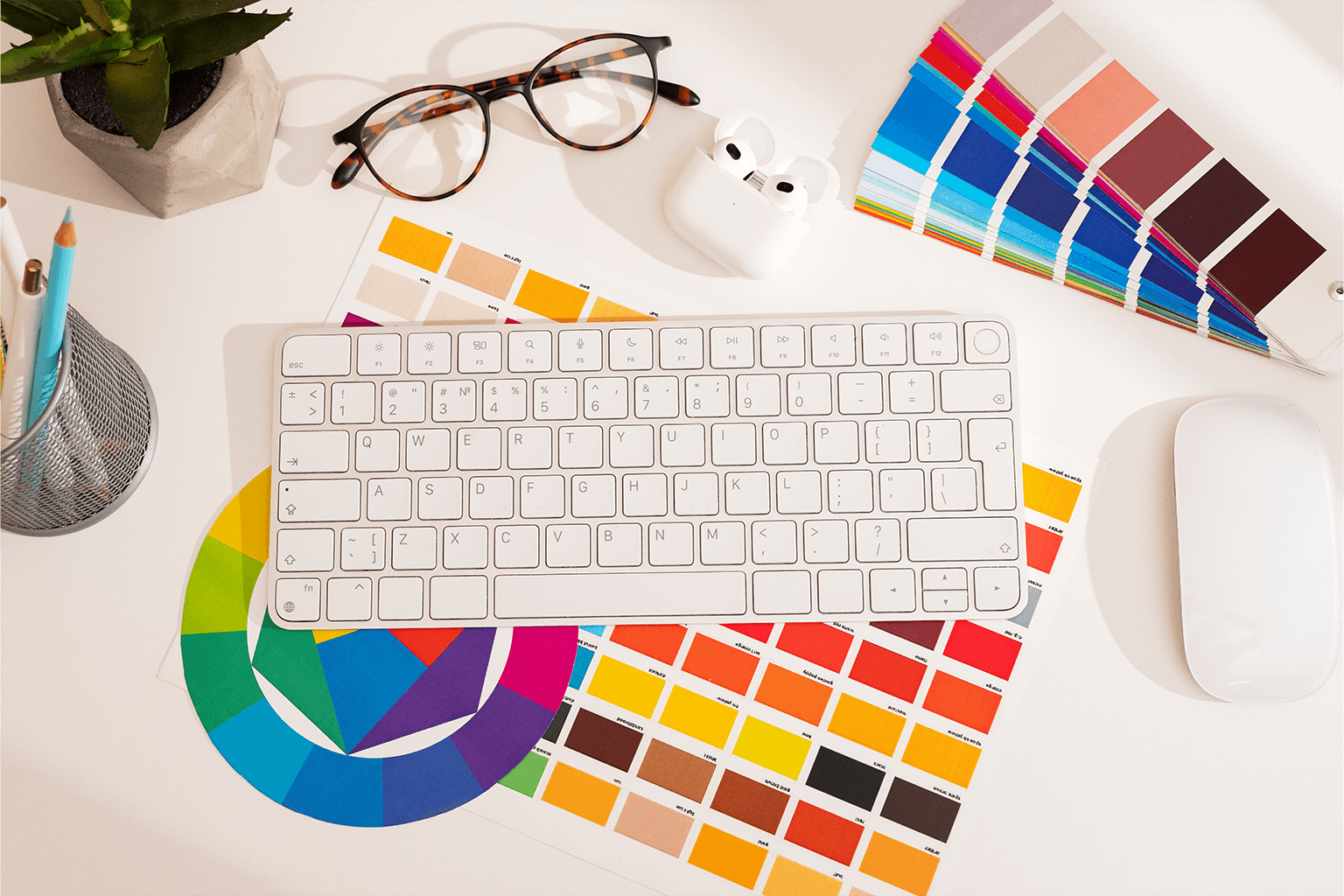
Colour is the element of web design that works fastest and most invisibly. Before a visitor reads a single word on your website, they have already formed an emotional response to its colour palette. That response shapes how they interpret your brand, how much they trust you, and whether the experience feels right for them. Understanding the psychology behind those responses, and using it deliberately, is one of the most powerful and most underused tools available in web design.
This is not about following rigid rules or subscribing to oversimplified colour theory. It is about understanding that colour communicates meaning before language does, and that the palette choices on your website are a form of non-verbal communication with every person who visits. Used well, colour reinforces everything else on the page. Used poorly or inconsistently, it introduces doubt and friction that no amount of good copy can fully overcome.
At AG Art Studio, colour strategy is one of the earliest and most consequential decisions in every design project we take on. Here is what the research says, what it means in practice, and how to evaluate whether your current palette is working for or against you.
Why colour works the way it does on the brain
Colour perception is processed in the visual cortex faster than any other visual input. The emotional associations attached to colours are formed through a combination of biological responses, cultural conditioning, and personal experience. Some associations are close to universal: warm colours such as red and orange activate alertness and urgency at a physiological level. Cool colours such as blue and green are associated with calm and safety across most cultures. Others vary significantly between regions and contexts.
What makes colour psychology particularly relevant to web design is the speed at which it operates. A visitor does not consciously decide how a colour makes them feel. The response is automatic, pre-verbal, and happens in the first fractions of a second of exposure. By the time a visitor is reading your headline, your colour palette has already begun building or undermining their trust in your brand. That makes it one of the few design decisions that shapes every subsequent moment of the user experience.
Colour does not just make a website look better. It tells visitors who you are, whether you can be trusted, and whether this is the right place for them, all before they read a single word.
What the major colours communicate on a website
Blue: trust, reliability, and authority
Blue is the most consistently chosen brand colour across sectors, and the reason is its near-universal association with trust, stability, and competence. It is the dominant colour in financial services, healthcare, technology, and professional services precisely because these industries require the highest levels of trust from their customers. Blue also has lower emotional arousal than warm colours, which makes it comfortable for extended reading and for contexts where visitors need to feel safe and in control. The risk with blue is genericness: a mid-tone blue website in a sector dominated by mid-tone blue websites communicates nothing distinctive. Shade selection, pairing, and application matter enormously.
Red: urgency, energy, and appetite
Red is the highest-arousal colour on the spectrum. It increases heart rate, creates a sense of urgency, and draws the eye faster than any other colour. In web design, red is most effective as an accent used selectively for calls to action, alerts, or key interactive elements where immediate attention is the goal. Used as a dominant colour, red is associated with boldness and confidence in some contexts and with danger or aggression in others. The appetite association that makes red so common in food branding is well documented, but its transfer to other sectors requires careful management of shade and context. Overuse of red creates visual fatigue and anxiety rather than engagement.
Green: health, growth, and reassurance
Green carries strong associations with nature, health, growth, and financial wellbeing. It is the colour most strongly linked to environmental and sustainability positioning, and is increasingly prominent in wellness, food, finance, and any brand that wants to signal responsible practice. Green also functions as a positive confirmation signal in interfaces, which is why it is the near-universal colour for success states, approval buttons, and positive notifications. For brands in sectors where reassurance and natural credibility are central, green can be a significantly more distinctive and appropriate choice than the default blue, while carrying a comparable trust signal.
Yellow and orange: optimism, warmth, and accessibility
Yellow and orange occupy a distinct emotional space: high energy without the aggression of red, warm without the heaviness of dark tones. Orange in particular has strong associations with friendliness, creativity, and approachability, which makes it a common choice for brands that want to feel welcoming and energetic without being intimidating. Yellow at full saturation is one of the most visually demanding colours to use at scale, as it can create strain and visual noise, but used in considered proportions it communicates optimism and clarity. Both colours work well as accent tones that bring warmth and life to otherwise cool or neutral palettes.
Black and white: premium, clarity, and sophistication
Black and white are not neutral choices, despite being perceived that way. Black communicates premium positioning, authority, and sophistication. It is the dominant palette of luxury brands precisely because it signals confidence and exclusivity without relying on a specific colour association. White communicates cleanliness, simplicity, and space, which is why it dominates in healthcare, technology, and any sector where clarity and trust are the primary emotional goals. The combination of high-contrast black and white as a primary palette is one of the strongest available signals of premium positioning, and the white space it creates is a design value in itself, signalling confidence and restraint.
The four principles of effective colour use in web design
How colour choices differ by industry
Colour mistakes that undermine brand credibility
- Count the distinct colours used across your website; if the number exceeds five including neutrals, your palette needs editing
- Check your body text contrast ratio using the free WebAIM Contrast Checker; aim for at least 4.5:1 against the background
- Identify which colour is used for your primary call to action button and check it does not appear on any other element on the same page
- View your homepage in greyscale by desaturating a screenshot; your hierarchy and readability should still be clear without colour
- Compare your palette to three direct competitors; if your colours are indistinguishable from theirs, you are blending in rather than standing out
- Check that your colour usage is consistent across all pages; the same hex values should appear in the same roles on every page
- Test your palette with someone from your target audience and ask what the colours make them feel about the brand, without prompting
- Ensure your colour choices meet the expectations of your sector without simply copying the category default
Colour decisions are rarely revisited once a website is live, which makes getting them right at the design stage particularly important. A palette chosen thoughtfully, grounded in an understanding of your audience and sector, and applied consistently and with discipline, is one of the most durable competitive advantages available in visual communication. It operates on every visitor, on every visit, without a word being read.
Most well-designed websites operate with three to five colours: a dominant background colour, a secondary supporting colour, a primary text colour, a subtle neutral, and a single accent colour used for interactive elements and calls to action. Keeping the palette tight is a discipline that forces clarity. Every colour added beyond what is necessary creates a decision point for the eye and risks undermining the visual hierarchy you have worked to establish.
Yes, though the effect is often overstated in isolation. Colour does not convert on its own; it converts in combination with contrast, placement, copy, and context. The most well-documented colour effect on conversion is the impact of contrast on call-to-action buttons: a button that stands out clearly from its surrounding page converts better than one that blends in, regardless of the specific colour used. The right question is not which colour converts best in general, but which colour creates the clearest visual priority in your specific design context.
The most durable palettes are those grounded in brand strategy rather than trend cycles. A colour choice that is driven by what communicates the right things to your specific audience will outlast any trend. That said, staying aware of colour trends is useful as a signal of where your sector's visual language is moving, and for identifying when your palette is starting to feel dated relative to competitors. The aim is to be current without being trend-dependent: a palette that feels contemporary but is not so tied to a specific moment that it will look dated in three years.
Start with your audience and your positioning rather than with colour tools. Define three to five words that describe how you want your brand to feel to your ideal customer. Then identify what colours carry those associations in your sector and cultural context. Look at what your direct competitors use and identify the gap: where is there space to be distinctive while still meeting sector expectations? From that foundation, use a tool such as Coolors or Adobe Color to develop and test combinations that work harmoniously and pass contrast checks.
Using the accent colour on too many elements is the single most common and most damaging colour mistake in web design. When the colour intended to signal "click here" or "this is important" appears on headings, icons, decorative borders, background panels, and buttons simultaneously, it loses all hierarchy value. The visitor's eye has no clear direction. The fix is simple: reserve your accent colour for one role only, typically the primary call to action, and use neutrals or secondary tones for everything else that needs visual distinction.
Dark mode is appropriate for brands where it reinforces the positioning: technology, creative, premium, or nighttime-use products. It is less appropriate for sectors where light, cleanliness, and openness are core associations, such as healthcare, education, or family-oriented services. If you want to offer dark mode as an option for user preference rather than as a brand statement, that is a different and valid decision, but it requires designing two fully considered colour systems rather than one, which is a significant additional investment. Half-implemented dark modes that only partially convert the palette are worse than either a fully considered light or dark design.