

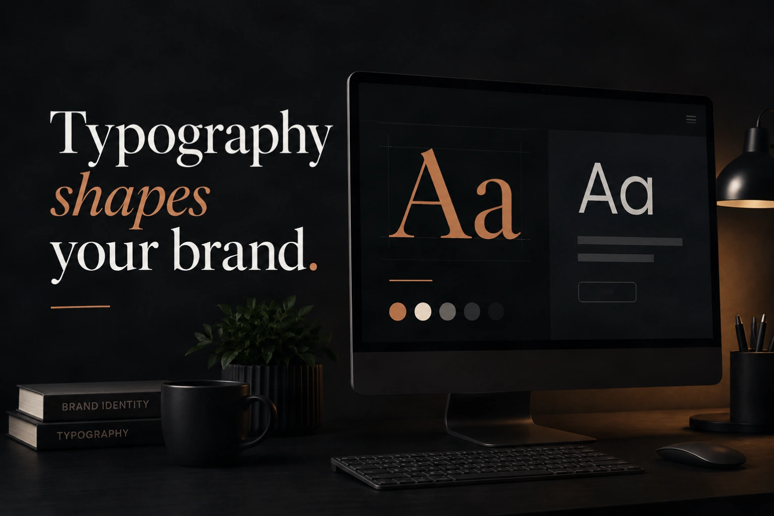
Typography is the silent architecture of every website. It does not shout for attention the way colour or imagery does, but it shapes the experience of every single word a visitor reads. Done well, it makes your content feel effortless to absorb, communicates personality without saying anything explicit, and creates a visual rhythm that guides people through your pages with confidence. Done poorly, it creates friction, signals a lack of care, and undermines the credibility of everything else on the page.
Most businesses give typography a fraction of the attention it deserves, treating font selection as a cosmetic detail to resolve quickly rather than a strategic brand decision with measurable consequences. The businesses that understand typography as communication, not decoration, are the ones whose websites feel distinctly more polished and trustworthy than those of their competitors — often without the visitor being able to articulate why.
At AG Art Studio, typography is one of the first and most deliberate decisions in every web design project. Here is what the research says, what the principles are, and how to evaluate whether your current typography is working for or against your brand.
Why typography carries more brand weight than most businesses realise
Typography communicates on two levels simultaneously. At the explicit level, it presents your words. At the implicit level, it communicates personality, authority, warmth, precision, and dozens of other brand qualities through the visual characteristics of the letterforms themselves, before a single word has been read. A serif typeface used in financial services communicates something different from a geometric sans-serif used in a technology context, not because of any rule but because of accumulated cultural associations built up over decades of brand communication.
Research from the MIT Media Lab found that readers make judgments about the credibility and emotional character of text based on typeface choice in under 200 milliseconds. That is before the brain has processed the meaning of any individual word. The font is communicating before the language is. This is not a marginal effect. It shapes how readers interpret everything that follows: the same words in a poorly chosen typeface are perceived as less credible, less authoritative, and less trustworthy than in a well-chosen one.
Typography is not what you read. It is the feeling you have while you are reading. The best typography is invisible — it simply makes everything clearer, easier, and more trustworthy.
The five typeface categories and what they communicate
Serif typefaces: authority, tradition, and credibility
Serifs are the small finishing strokes at the ends of letterforms. Typefaces with these strokes, including Times New Roman, Georgia, Garamond, and more contemporary serifs such as Playfair Display and Merriweather, carry associations of tradition, authority, and established credibility. They are the default choice of newspapers, academic publishing, legal documentation, and luxury brands because the visual form has accumulated those associations over centuries of use. On a website, a well-chosen serif in the right context communicates that the brand behind it is established, serious, and trustworthy. The risk with serifs is appearing dated if the specific typeface is overused or poorly executed; the choice of which serif matters enormously, not just the category.
Sans-serif typefaces: clarity, modernity, and accessibility
Sans-serif typefaces lack the finishing strokes of serifs, giving them a cleaner, more geometric appearance. Typefaces such as Helvetica, Inter, Roboto, and DM Sans dominate digital design because they render clearly at small sizes on screens, communicate modernity and simplicity, and feel approachable without sacrificing professionalism. The technology sector, most SaaS products, and brands that want to feel contemporary and user-focused almost universally choose sans-serif as their primary typeface. The risk is genericness: with so many brands using similar sans-serif typefaces, the category is crowded, and differentiation requires either an unusual choice within the category or a thoughtful pairing strategy that introduces personality through a contrasting secondary typeface.
Display and decorative typefaces: personality and differentiation
Display typefaces are designed for use at large sizes, typically in headlines and hero sections rather than body copy. They range from bold geometric forms to expressive hand-lettered styles, and their primary function is to communicate distinctive personality rather than comfortable readability at scale. Used well, a display typeface in a hero heading can instantly signal something memorable and specific about a brand's character that a standard sans-serif cannot. Used poorly, display typefaces create illegibility, inconsistency, and a visual identity that looks more like a design experiment than a considered brand decision. The key discipline is restraint: display typefaces earn their impact through selective use, not by dominating the whole page.
Script and handwritten typefaces: warmth, craft, and authenticity
Script typefaces mimic handwriting or calligraphy and carry associations of warmth, craft, personal attention, and artisanal quality. They appear most naturally in food and beverage branding, wedding and lifestyle services, creative businesses, and any context where a human, personal quality is central to the brand proposition. On websites, they work best in limited applications: a logo treatment, a hero headline that introduces a personal statement, or a signature-style accent. Used as body text they become illegible quickly, and used too broadly they can undermine the professional credibility that a site also needs to communicate. The pairing of a script accent with a clean sans-serif body typeface is one of the most common and most effective typographic combinations in this category.
Monospace typefaces: precision, technical authority, and transparency
Monospace typefaces, in which every character occupies the same horizontal width, are associated with code, data, and technical precision. They appear naturally in developer tools, fintech interfaces, data-heavy dashboards, and any brand that wants to signal systematic, analytical rigour. Used selectively in a website context, monospace type can create a distinctive accent that communicates technical credibility without requiring the whole design to feel like a code editor. A monospace typeface used for statistics, data points, or micro-labels within an otherwise clean sans-serif layout is a technique used effectively by many technology brands to signal depth without sacrificing accessibility.
The six principles that govern effective web typography
Typography by industry: what works where
| Industry | Best-fit typeface style | What to avoid | Pairing approach |
|---|---|---|---|
| Financial services | Classic serif or clean geometric sans | Playful or decorative display fonts | Serif heading, sans-serif body |
| Technology and SaaS | Geometric or humanist sans-serif | Script or heavily stylised serifs | Single sans-serif family, multiple weights |
| Creative and design | Distinctive display paired with clean body | Generic system fonts that signal no design intent | Bold display heading, neutral sans body |
| Food and hospitality | Warm serif or refined script for accents | Cold, clinical sans-serifs | Script accent, humanist sans body |
| Healthcare and wellness | Humanist sans or soft rounded typefaces | Heavy condensed or aggressive display fonts | Soft rounded sans for both, varied weights |
| Legal and professional services | Authoritative serif or refined transitional serif | Casual script or overly contemporary display | Serif heading, clean sans-serif body |
The most common typography mistakes on business websites
- Count the number of distinct typefaces used across your site; if the number exceeds three, your palette needs editing
- Check your body text size on desktop and mobile; it should be no smaller than 16px on desktop and 15px on mobile
- Verify your body text line height is between 1.5 and 1.75; paste a paragraph of your text into a line-height tool and confirm
- Check text contrast using the WebAIM Contrast Checker; body text must achieve at least 4.5:1 against its background
- Review your heading hierarchy on a key page; H1, H2, and H3 should be clearly distinguishable from each other and from body text
- Check your longest body text lines on desktop; if they exceed 75 characters consistently, your content container is too wide for comfortable reading
- View a key page on a mobile device and check that headings scale down proportionally without overwhelming or disappearing
- Ask whether your typeface choice communicates the right brand personality for your sector and your specific positioning within it
- Check your page load time with and without web fonts; if fonts are adding more than 200ms to load time, they need to be optimised or replaced
- Compare your typography to three direct competitors and assess whether your choice is distinctive, generic, or actively weaker than theirs
Typography is one of the design decisions that separates websites that feel genuinely premium from those that simply look busy. It is not the most visible element of a page, but it is one of the most felt. A visitor who spends ten minutes reading your content comfortably, absorbing your expertise and your credibility without noticing the type, has had exactly the right typographic experience. The goal of great web typography is to be completely invisible while making everything else more powerful.
5 most used Google Fonts pairings in professional web design
Google Fonts provides over 1,500 free typefaces, which makes choosing a starting point genuinely overwhelming. The five pairings below are among the most widely used by professional designers precisely because they are proven to work across a wide range of contexts. Each is shown in a live preview so you can see the contrast and character before implementing anything.
Good design is good business.
Your website is the first thing most clients will ever see about your business. The fonts you choose shape that impression before a single word is read — communicating authority, warmth, or precision through the visual character of the letterforms alone.
One of the most trusted editorial pairings on the web. Playfair Display brings high contrast and classical elegance to headings, while Source Sans 3 provides exceptional screen readability for body content. The contrast between the two creates a strong visual hierarchy with a premium, editorial feel.
Built for clarity. Designed to convert.
Typography is the silent architecture of every website. Used well, it guides visitors through your content with confidence and signals the kind of care and attention that makes a brand trustworthy before any conscious evaluation takes place.
Among the most downloaded pairings on Google Fonts. Montserrat's geometric boldness creates strong, confident headings while Lato's humanist warmth makes body text feel friendly and highly readable. The combination works across almost any modern business context and loads quickly due to both fonts being highly optimised.
Expertise you can read. Trust you can feel.
The right typeface makes readers forget they are reading and focus entirely on what is being said. That invisibility is the highest compliment typography can receive — and it is achieved through deliberate decisions about size, spacing, weight, and contrast.
Designed specifically for screen readability, Merriweather is one of the most legible serif options available on Google Fonts. Paired with Open Sans, the world's most downloaded Google Font, this combination is the gold standard for content-heavy websites where long-form reading comfort is the primary concern.
Distinctive from the first glance.
A well-executed font pairing creates a visual relationship between heading and body that feels intentional and considered — signalling to every visitor that the business behind the website pays attention to the details that most people overlook.
Raleway's elegant thin strokes and distinctive uppercase letterforms make it a standout heading choice for brands that want visual distinction without sacrificing professionalism. DM Sans is a modern, highly legible companion that brings warmth and approachability to the body copy. Together they strike a balance between personality and clarity that works particularly well for creative and technology brands.
Where elegance meets function.
The most enduring typographic combinations are those where two very different typefaces share an underlying sense of proportion and intent. That shared character is what makes a pairing feel cohesive rather than simply contrasting — and it is what separates considered design from accidental variety.
Cormorant Garamond is one of the most refined and beautiful display serifs available for free. Its high contrast and classical proportions signal luxury and sophistication in a way few other Google Fonts can match. Paired with Inter — the most widely used interface typeface in modern digital product design — the result is a combination that feels simultaneously timeless and contemporary, ideal for premium brands that need to communicate both heritage and relevance.
Google Fonts offers a large library of free, high-quality typefaces and is a perfectly legitimate choice for most business websites. The main considerations are performance and privacy. Loading fonts directly from Google's servers adds an external request to your page load, which adds latency. Self-hosting Google Fonts, which involves downloading the font files and serving them from your own server, eliminates that latency and avoids sharing visitor IP addresses with Google, which has become a compliance consideration in some jurisdictions under GDPR. For most businesses, self-hosting Google Fonts is the best of both worlds: free, high-quality typefaces with no performance or privacy penalty.
The most reliable font pairing principle is contrast with compatibility. Choose a heading typeface and a body typeface that are visually different enough to create clear hierarchy but share enough underlying character to feel like they belong together. A common and dependable approach is pairing a serif heading font with a sans-serif body font, or a distinctive display heading with a highly readable humanist sans body. Tools such as Fontpair.co and the pairing suggestions in Google Fonts are useful starting points. When in doubt, using two weights of a single well-designed type family is almost always a safe and effective choice.
Fonts affect SEO indirectly through two mechanisms. First, web font files add to page weight and load time; heavy font libraries or poorly optimised font loading can reduce your Core Web Vitals scores, which Google uses as a ranking signal. Second, typography quality affects bounce rate and time on page: a page that is difficult to read drives visitors away faster, and those behavioural signals influence how Google evaluates the quality of the page. Good typography does not directly improve rankings, but poor typography reliably worsens the metrics that do.
16px is the widely accepted baseline minimum for body text on desktop, and many design systems use 17px or 18px for content-heavy pages where comfortable extended reading is the goal. On mobile, 15px to 16px is the appropriate range. The right size also depends on the specific typeface: some typefaces are designed with larger x-heights that make them feel more spacious at smaller sizes, while others need to be set larger to achieve the same apparent size. Always test body text at the intended size across both desktop and mobile before finalising it, and err on the side of slightly larger rather than smaller.
Typography improvements can contribute to conversion rate improvements, though isolating the effect of a font change alone is difficult because typography works in combination with layout, colour, and copy. What is well documented is that readability improvements, achieved through better type sizing, spacing, and contrast, reduce the cognitive effort required to process information, and reduced cognitive effort is associated with higher trust and higher conversion rates. A typography overhaul that makes content significantly easier to read and that better matches the brand's desired positioning reliably improves the overall quality of the user experience, and improved user experience reliably improves conversion.
Three to four weights across a type system is the practical maximum for most websites: a regular weight for body text, a medium or semibold for subheadings and interface labels, and a bold or extrabold for primary headings. Each additional weight loaded from a web font service adds to page weight, so loading only the weights you genuinely use is both a performance and a design discipline. A website that relies on a single weight for everything lacks hierarchy; one that loads eight weights to use three adds unnecessary load time for minimal visual gain.